


Have you ever looked at a famous logo and thought about how you would design it differently? Maybe you revel in finding a brand’s hidden meaning in their logo’s negative space? Well, you’re in good company! We rounded up 10 graphic designers who created fresh takes on some of the most famous logos out there—and we think their interpretations are worth sharing.
On the left, you’ll find each brand’s current logo and on the right you’ll see the reimagined version by a different designer in our community. Now, enjoy these just-for-fun, hypothetical redesigns, and get inspired to try your hand at reworking a well-known logo yourself! Whether you put your spin on the famous logo of Apple or Google, FedEx or Coca-Cola, we’d love to see what you come up with on Dribbble.
1. Amazon

Designer Sam Bunny’s interpretation of this famous company logo takes a whole new approach, removing its iconic arrow and replacing it with a simple, balanced curve. Here’s what Sam had to say about his new concept:
“This concept looks to refresh the current Amazon brand by reducing the detail while aiming to retain the same feel and tone. It keeps the iconic A to Z link and smile without the need for an arrowhead, which is replaced with the gradient that helps indicate movement and direction from A to Z.”
2. NASA

If you follow Rafael Serra on Dribbble, you’re probably familiar with the typographic logo interpretations he frequently shares. His newest concept for NASA’s logo simplifies the original emblem significantly while staying true to its overall circular structure. We love the subtle way Rafael’s red swash lines work to form the crossbar of each letter ‘A.’
3. Slack

San Francisco institution, Slack, rolled out a fresh redesign of their logo earlier this year which sparked a lot of different opinions. Dribbbler Daniel Nave was inspired to put his own spin on the rebrand:

“What I tried to do here is some reverse engineering regarding the colors to show my love to the original [logo’s] unsaturated shades, and also put back the fragments together to a more cohesive form. I then tilted it by 45 degrees trying to bring some of its original mischievousnesses.”
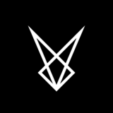
4. Red Bull

This modern take on Red Bull’s branding breathes life into the energy drink’s logo, dating back to the 1980s. Designer Dennis Pasyuk went with a clean, bold redesign that stays true to the iconic bull symbol yet simplifies it quite drastically. What do you think? Maybe it’s time Red Bull update their branding! Check out Dennis’ profile for more fun redesigns he’s played around with.
5. PlayStation

Graphic designer Gustavo Zambelli wowed us with his take on the popular video game console brand, PlayStation. He even presented two different options, both brightening the company logo’s color scheme yet holding true to its recognizable letterforms. Here’s what he had to say about his designs:

“The other day I had this idea to simplify the old logo of PlayStation. I know I’m playing with fire here, but let me say that I feel it looks pretty cool. A lot of you asked for the version with gaps on the S, the option B. I think it looks pretty good and more similar to the original. But personally, I still think that I like more option A. Because it’s simpler and since you already know the original logo, I think is not necessary to add the gaps on the S.”
6. Target

Irvan Pratama tried his hand at redesigning a new concept for one of the most recognized symbols in America — Target’s iconic bullseye logo. This designer softened the bright red color of the original logo design and incorporated a blue arrow signaling towards the center of the target. We think Irvan hit the bullseye with this design, no pun intended.
7. Gatorade

When logo designer Allan Peters decided to take a stab at simplifying the iconic Gatorade logo, he started a whole movement of designers chiming in to share their own take on the design. Check the rest out their ideas here!
“This is an idea I had a few weeks ago to simplify and strengthen the Gatorade logo. Click on the attachment to see the before and after. I also added a mock-up of the packaging.”
8. Starbucks

Coffee lovers around the world can probably recognize the Starbucks logo, at first glance, from a mile away. The twin-tailed mermaid symbol is one that has stood the test of time. This fun redesign concept by Jahng Hyoung Joon is inspired by the mermaid symbol and monoline characteristics in Starbuck’s current logo. However, Jahng renders the emblem a different shape and adds elements of playfulness through the simplistic smile in the mermaid’s face.
9. ZARA

The international fashion retail brand ZARA recently underwent a drastic rebrand earlier this year which sparked a lot of controversies. Designers, in particular, were not too keen on the drastic kerning in the new wordmark, including Gianluca Russo who thought many subtle improvements could be made:

“With higher ‘A’s, lower ‘R’ ending, random angles…there’s plenty of room for improvement in even seemingly simple logos! There’s much more in designing a logo than just taking a plain font and reducing the kerning. The devil is in the details.”
10. Meetup

Lettering artist Lance came up with a new typographic logo and stand-alone icon for Meetup, the online platform that helps users organize events. Lance’s proposed script appears to be a polished version of the original wordmark and adds a bouncy consistency throughout each letterform. We especially love how the stand-alone icon is reminiscent of the ‘M’ in Meetup without duplicating it line for line. Check out the many other logos Lance has tried redesigning here.
That’s a wrap! What do you think of these reimagined logos? Would you have done anything differently for these brand identities? Go check out these wonderful designers’ profiles on Dribbble and let them know what you think of their famous logo versions in the comments of their Shots.
For more logo design and graphic design resources and inspiration, read all about How to not screw up a logo: 6 essential tips, and check out the most recent branding and logo work our community has been working on.
Find more Community stories on our blog Courtside. Have a suggestion? Contact stories@dribbble.com.


