Last month, we previewed our brand new Dental Clinic demo. Our thanks to everyone who shared their initial thoughts with us via blog comments and within our WinForms RWA forum. In this post, I’d like to share detailed design mock-ups and explain how we used our newest WinForms Editor within this sample app (a control we built specifically for this demo).
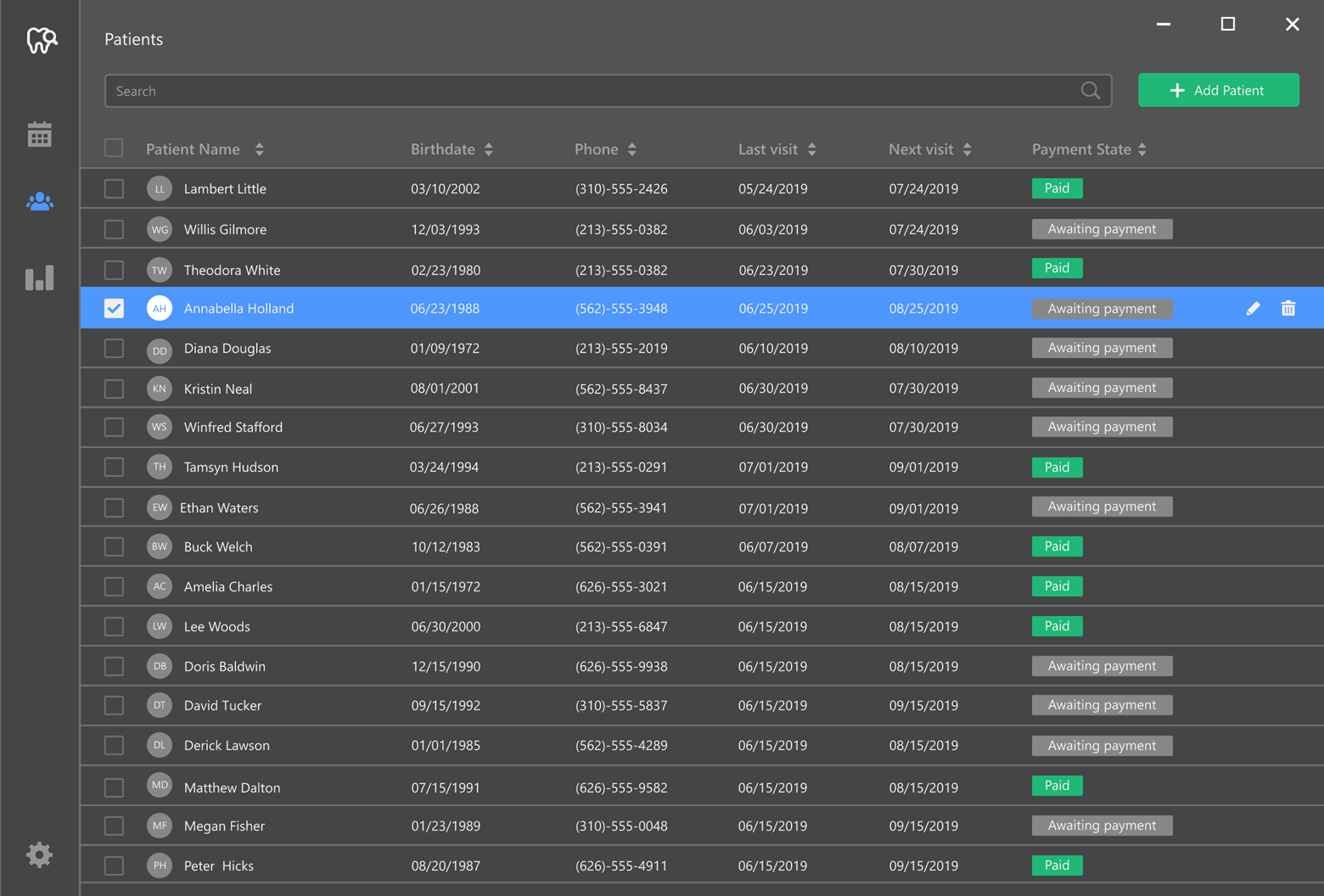
As you can see in the image below, the Dental Clinic app includes a vertical sidebar with buttons that allow users to navigate between application modules. The “Patients” module displays a grid with relevant patient data.
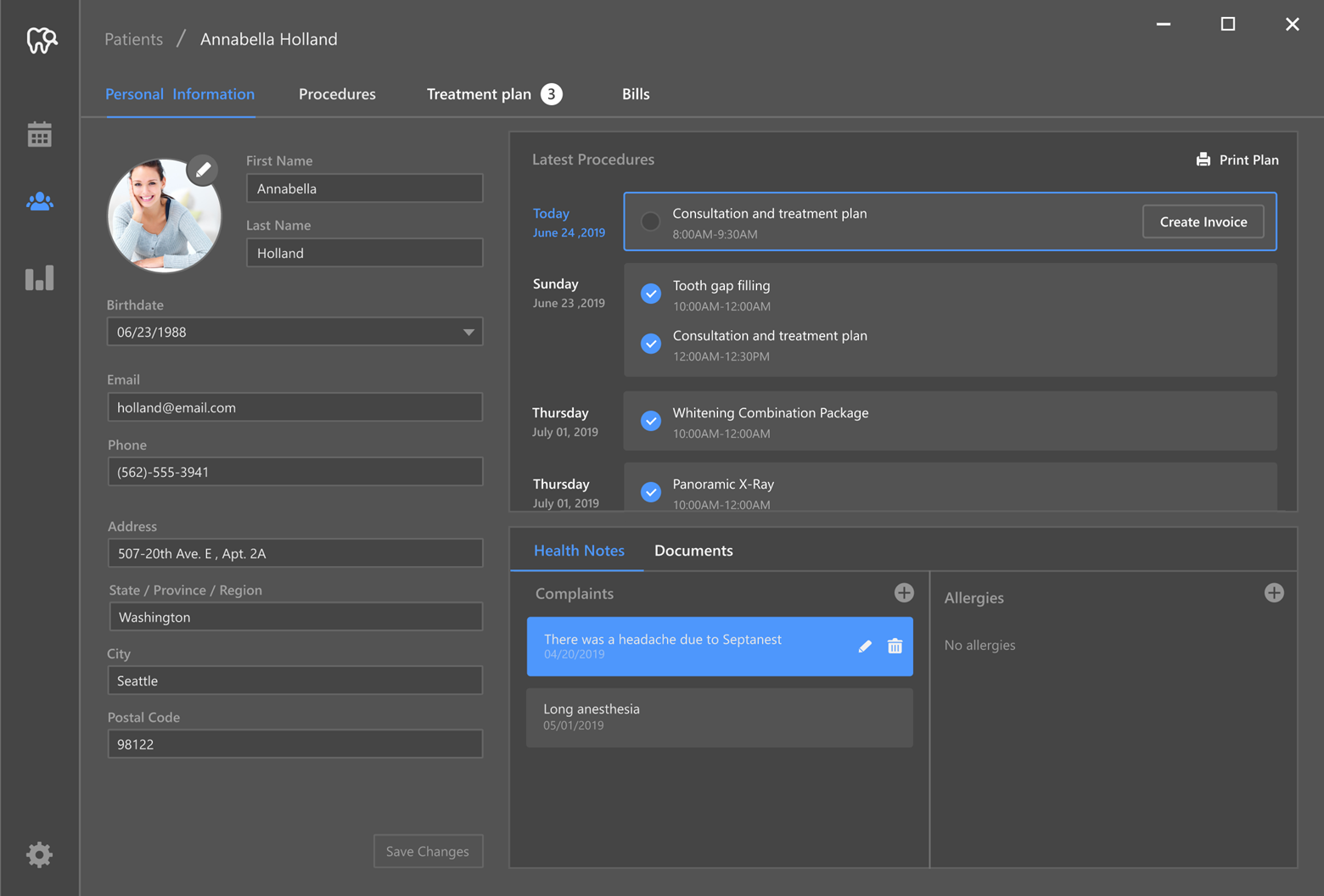
Staff can activate a multi-tab patient card to add new patient information or modify existing patient data. The first patient card tab stores/displays “Personal Information”, medical procedures (both upcoming procedures and those completed in the past), and important health advisories.
If a patient requires treatment, the dentist can navigate to the “Procedures” tab (wherein all procedures are grouped into categories). The doctor chooses the category (i.e., “Restoration”) and uses the interactive “tooth map” to select the appropriate procedure for each tooth.
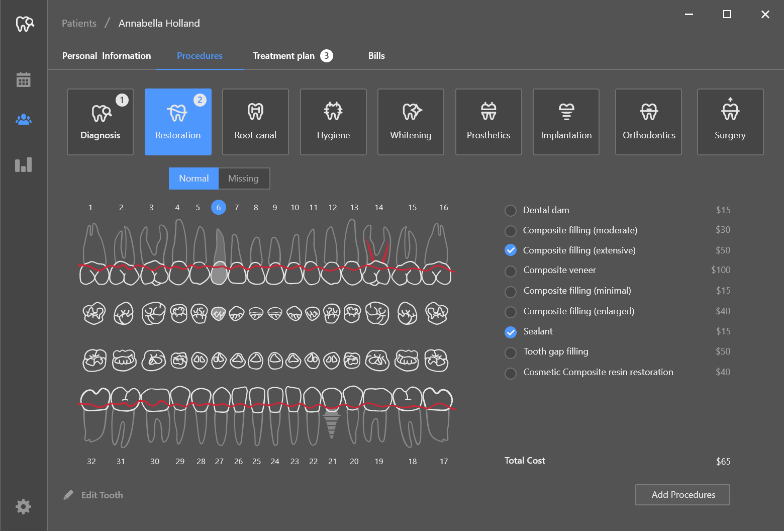
As you probably know by now, this “tooth map” was built with a new DevExpress WinForms control - the SvgImageBox editor (part of our v19.2 distribution).
Vector images are comprised of simple elements (paths, groups, etc.) rather than pixels. SvgImageBox analyzes the elements contained within a vector image, and allows you to highlight them or change visibility settings when necessary. In the Dental Clinic demo, the control displays/hides elements like "root canal" or "sealant" based upon selections made by the doctor.
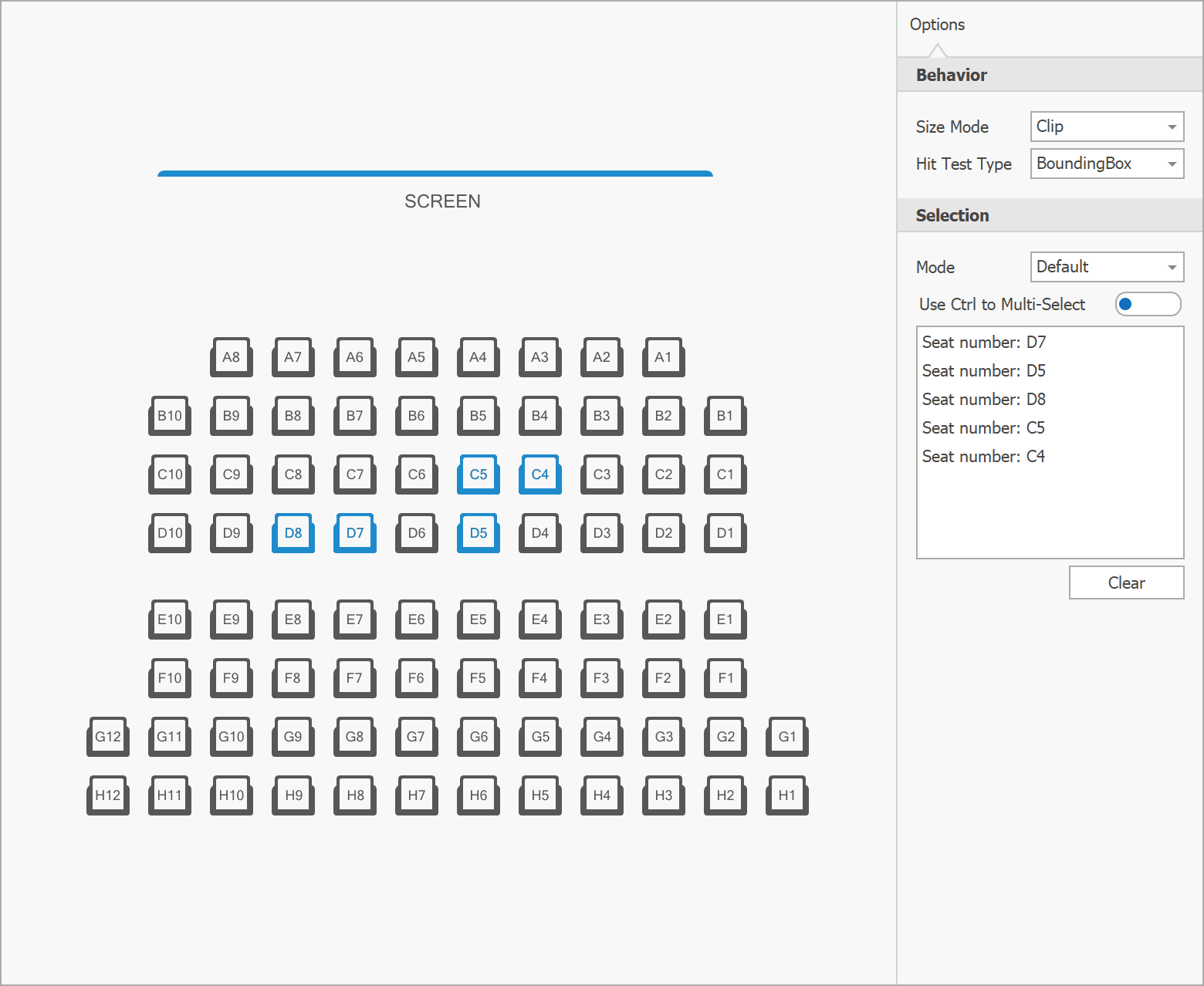
Our v19.2 installation includes a new module within the XtraEditors demo. This module demonstrates another use case for the SvgImageBox - ticket booking (users can reserve a spot in a theater with a simple mouse click). The seats inside the demo are drawn using three simple elements (seat number, the rectangle around it, and an element that represents armrests) organized into a group. A user can click or hover any of these three elements, and the entire group automatically “lights up” (the control fires a series of events that allows you to identify which element was hovered\clicked, and highlight this or any other element in response).
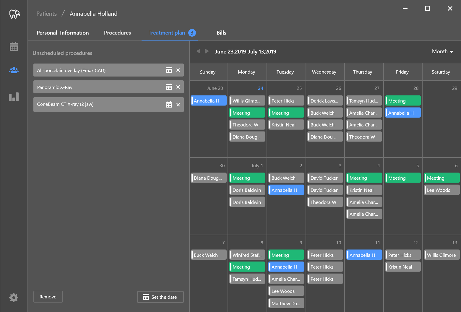
The third tab of a patient card is “Treatment Plan.” As its name implies, this tab allows a doctor to review all prescribed procedures and schedule them as needed.
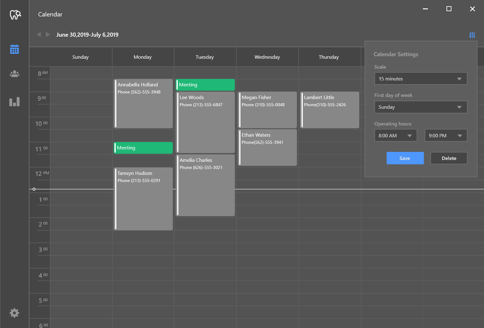
The “Calendar” module allows you to browse all scheduled procedures.
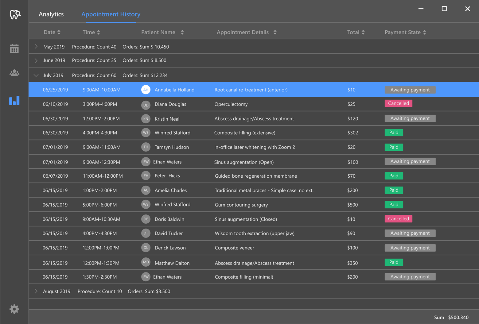
The final module of the app displays various graphs and charts, and full appointment history within the second tab.
In the next post of this blog series, we’ll dive into the technical details – we’ll detail the controls used for each module and how we wired up the app’s internal logic.
Feel free to share your questions and thoughts below, and stay tuned for the next blog post.
Free DevExpress Products - Get Your Copy Today
The following free DevExpress product offers remain available. Should you have any questions about the free offers below, please submit a ticket via the
DevExpress Support Center at your convenience. We'll be happy to follow-up.