MONTECATINI PRO
In six
weights
& four
widths

Montecatini takes its cues from the elegant Stile Liberty travel posters of Italy in the early 1900s. In its successful first release by Louise Fili Ltd in 2017, the typeface introduced distinctive ligatures typical of the time when Art Nouveau emerged as a worldwide phenomenon. We are now pleased to announce the expansion of the typeface into 24 styles, spanning 6 weights and 4 widths. With the addition of these new styles, Montecatini now has a dynamic capacity for comprehensive usage. Everything looks better in Montecatini, from book jackets to monograms to packaging and logos—and the wide selection of ligatures, weights, and widths make copyfitting a delight.

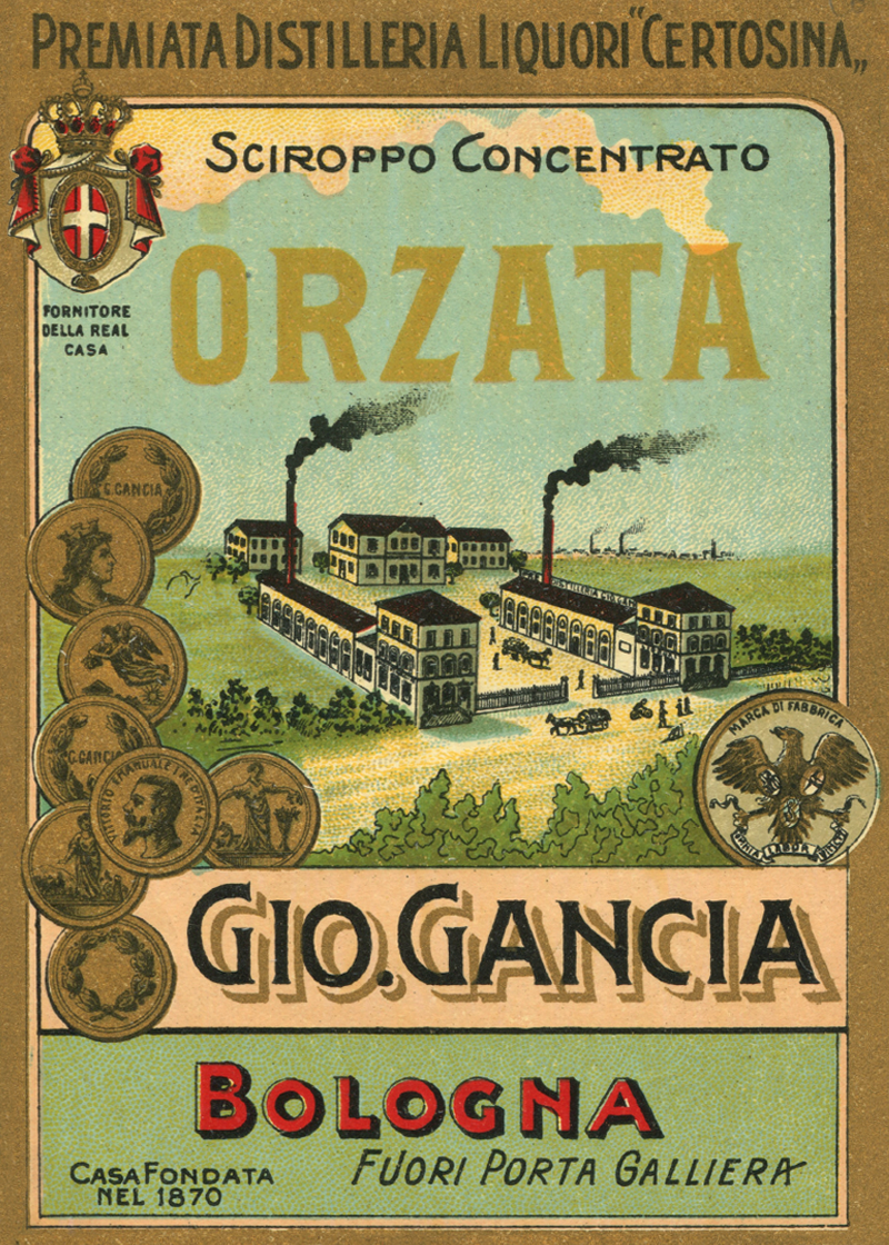
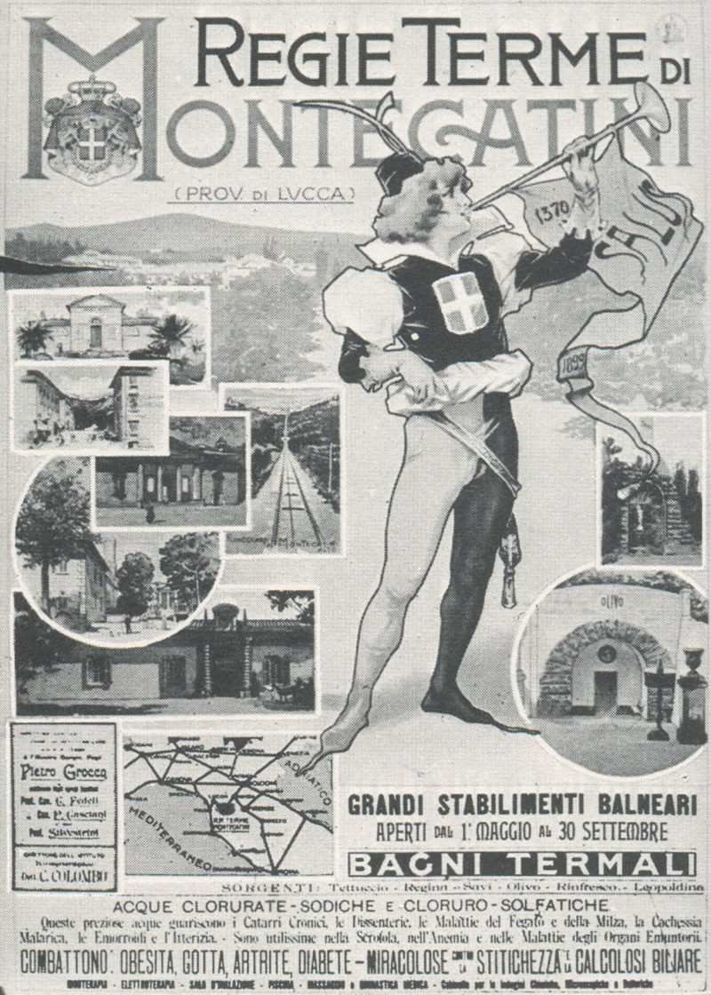
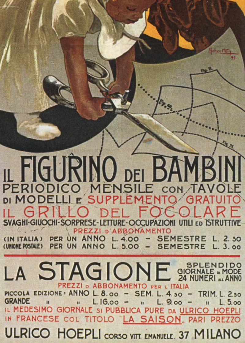
Montecatini Terme, the majestic spa in northern Tuscany, has drawn visitors in search of the healing powers of its mineral waters for over a century, and is perhaps best known for its cameo appearance in Fellini’s 8 ½. During Louise Fili’s first visit there in the early 1980s, she came across a poster with wonderfully idiosyncratic letterforms, which have been a continued source of inspiration ever since.
In looking back at the reference material of Stile Liberty posters, we renewed our focus on the variations of lettering, both condensed and expanded, light and bold. The use of an array of styles—peppered with ligatures throughout—created a vibrant typographic system all its own. We realized that it would be more advantageous to design with Montecatini if there were varying degrees of width and weight to work with. These observations would become the basis for how we interpreted the lettering’s behavior into a functional typeface.

OVERVIEW
Stretto
Light
Regular
Medium
SemiBold
Bold
Ultra
Normale
Light
Regular
Medium
SemiBold
Bold
Ultra
Ampio
Light
Regular
Medium
SemiBold
Bold
Ultra
Largo
Light
Regular
Medium
SemiBold
Bold
Ultra

FEATURES
Montecatini’s distinctive ligatures are now available as contextual alternates—the letters will automatically pair as you write, and the font will determine the most legible pairing options within the letter set. Additional features such as stylistic sets and swash characters provide further customization and can be accessed through Opentype features. With a robust selection of diacritics, Montecatini supports 200 different languages.
La Parisienne
Contextual Alternates
Tipografici
Stylistic Alternates
Hôtel Façonné
Language Support
- Á
- Ă
- Ǎ
- Â
- Ä
- À
- Ā
- Ą
- Å
- Ã
- Æ
- Ć
- Č
- Ç
- Ĉ
- Ċ
- Ð
- Ď
- Đ
- É
- Ĕ
- Ě
- Ê
- Ë
- Ė
- È
- Ē
- Ę
- Ẽ
- Ğ
- Ǧ
- Ĝ
- Ģ
- Ġ
- Ħ
- Ĥ
- Í
- Ĭ
- Ǐ
- Î
- Ï
- İ
- Ị
- Ì
- Ī
- Į
- Ĩ
- Ĵ
- Ķ
- Ĺ
- Ľ
- Ļ
- Ŀ
- Ł
- Ń
- Ň
- Ņ
- Ŋ
- Ñ
- Ó
- Ŏ
- Ǒ
- Ô
- Ö
- Ọ
- Ò
- Ő
- Ō
- Ø
- Õ
- Œ
- Þ
- Ŕ
- Ř
- Ŗ
- Ś
- Š
- Ş
- Ŝ
- Ș
- ẞ
- Ə
- Ŧ
- Ť
- Ţ
- Ț
- Ú
- Ŭ
- Ǔ
- Û
- Ü
- Ụ
- Ù
- Ű
- Ū
- Ų
- Ů
- Ũ
- Ẃ
- Ŵ
- Ẅ
- Ẁ
- Ý
- Ŷ
- Ÿ
- Ỳ
- Ȳ
- Ỹ
- Ź
- Ž
- Ż
PLT No. 9 ¾
Ordinals & Fractions


Montecatini was designed by Louise Fili Ltd. Original design by Louise Fili and Nick Misani. Expanded design by Louise Fili and Andy Anzollitto. Additional assistance from Schriftlabor. Website designed and developed by Matthew Smith/Louise Fili Ltd.