Telerik UI For Xamarin R1 2020 - What's New

Find our what we have in store for you in the first Telerik for Xamarin release of 2020.
Now that we have welcomed 2020, it's time for Telerik UI for Xamarin's first release of the new year (and decade) to emerge on the scene. The highlights of the latest version include a new set of picker controls, as well as an additional view mode for the Calendar control - the Agenda view. We have also included support for the RadSpreadProcessing library which enables you to work with spreadsheet documents.
As always, all the fixes and improvements we introduce in the suite are to help you in your endeavor to bring great cross-platform mobile experiences to your customers.
Picker Controls
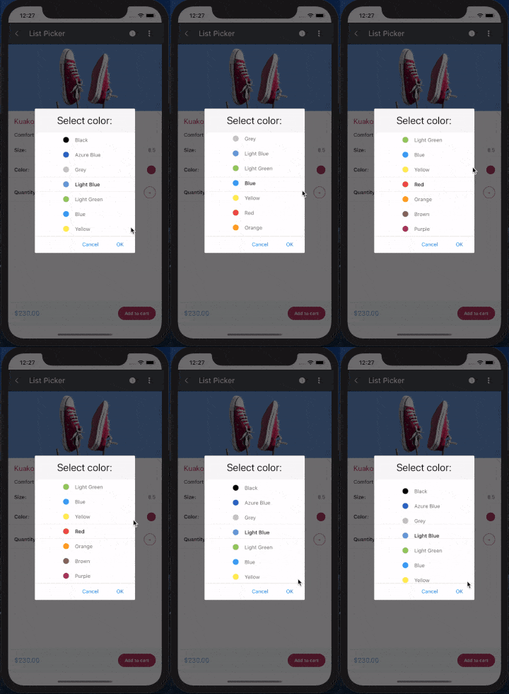
We have introduced the following set of picker controls which were specifically designed to cover the most common scenarios:List Picker
The List Picker control allows you to select a single item from a list of items which is visualized inside a popup. The control provides the ability to loop its items infinitely while scrolling. You can also fully customize the dialog appearance, style and define templates for all the items or specifically customize the selected item.
Our List Picker control includes the following features:
- Looping: loops items infinitely while scrolling
- Templates: define a template for the list items, as well as the selected one
- UI Virtualization: visual elements are being reused when scrolling to boost performance
- Display string format: chose what text to display when an item from the list is picked
- Flexible styling API: style the items, popup, header and footer of the picker
- Command support: commands for clearing a selected item, opening and closing the dialog
You can find more information on the List Picker in the documentation - Getting Started with List Picker for Xamarin.
DateTime Picker
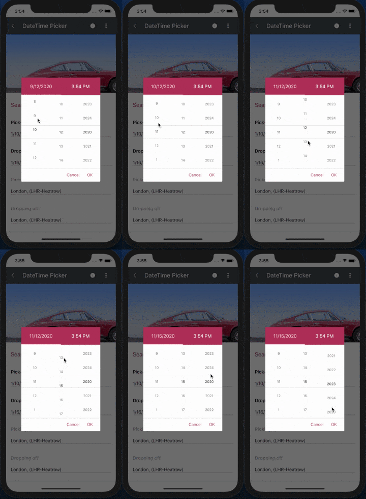
The DateTime Picker for Xamarin provides an easy way to choose a date, time or a combination of both depending on the used format string. As in the List Picker, its items are visualized inside a popup. The DateTimePicker control has a number of features which allow you to set a date range, DateTime formats and fully customize the dialog appearance such as its header and footer.
Features for DateTime Picker for Xamarin include:
- String format: set a standard date and time format string, and create a date picker, time picker or combination of both.
- Date Range: define a start and end date to enable the users to choose a date in between
- Display string format: choose what text to display when a date/time is picked
- Templates: templates for header, footer, picker placeholder and displayed text
- Flexible Styling API: easily style the Spinners, Popup, header, footer and text displayed when date/time is picked
- Commands Support: commands that clears the selected date/time and allows you to open and close the dialog
You can find more information on the DateTime Picker in the documentation - Getting Started with Date and Time Picker for Xamarin.
Templated Picker
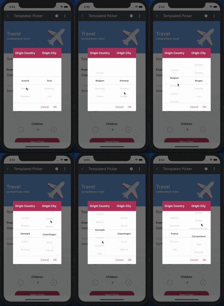
If the DateTime/List Pickers are not sufficient for you to meet your design requirements, you can use the TemplatedPicker control. It provides you with the ability to set custom content within the picker, making it the most agile option. On top of that, you can still use the template/styling modifications mentioned above.
Features for our Templated Picker for Xamarin include:
- Selector template: define a template for the items
- Display string format: chose a text to display when an item is picked
- Flexible Styling API: style the spinners, popup, its header and footer
- Commands support: clear a selected item, open and close the dialog via commands
Once again, detailed information about the control can be found in the documentation - Getting Started with Custom Picker for Xamarin.
Calendar Agenda View
A new view mode for the RadCalendar control is included - the Agenda View. It shows a list of appointments grouped by date, providing a convenient way to display events chronologically.
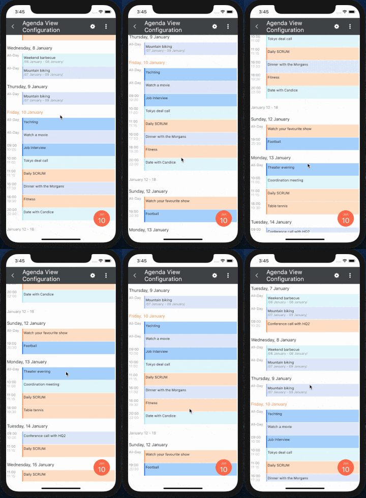
You have full control over the way the Agenda view is visualized - you can set custom date and time formats as well as modify the style of each agenda item separately. The AgendaViewSettings class below shows a simple setup:
<telerikInput:RadCalendar x:Name="calendar"
              ViewMode="Agenda">
      <telerikInput:RadCalendar.AgendaViewSettings>
          <telerikInput:AgendaViewSettings MonthItemFormat="YYYY MMM"
                              WeekItemStartDateFormat="dd MMMM"
                              WeekItemEndDateFormat="dd"
                              DayItemFormat="EEE d MMM"
                              AppointmentItemTimeFormat="HH mm"
                              AppointmentItemEndDateFormat="MMM d"
                              AppointmentItemStartDateFormat="MMM d"/>
      </telerikInput:RadCalendar.AgendaViewSettings>
  </telerikInput:RadCalendar>
More information on the Agenda View mode can be found in the documentation - View Modes - Agenda View.
Calendar Non-Working Hours Styling
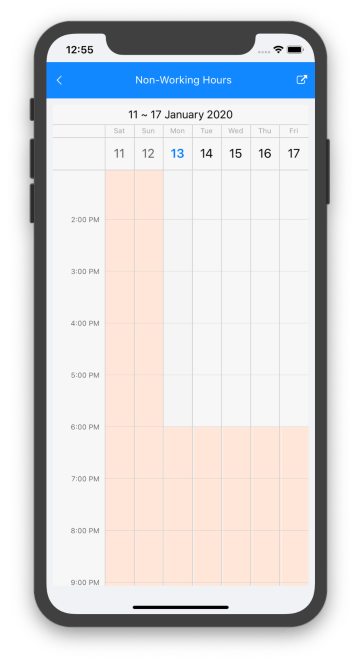
In R3 2019 we introduced the special slots for the RadCalendar control, a feature that lets you easily make specific time ranges in DayView/MultiDayView more prominent. In the latest release, we have added some styling sugar to directly highlight the non-working hours slots as fast as possible. All you need to do is define your work start and end times and apply a specific style for these periods directly in the DayView/MultiDayViewSettings.
<ResourceDictionary>
    <telerikInput:CalendarSpecialSlotStyle x:Key="MyNonWorkingHoursStyle" BackgroundColor="#FFE6D8" />
</ResourceDictionary>
…
<telerikInput:RadCalendar x:Name="calendar"
                  ViewMode="MultiDay">
    <telerikInput:RadCalendar.MultiDayViewSettings>
        <telerikInput:MultiDayViewSettings VisibleDays="7"
                                 WorkStartTime="9:00:00"
                                 WorkEndTime="18:00:00"                                 NonWorkingTimeSlotsStyle="{StaticResource MyNonWorkingHoursStyle}"/>
    </telerikInput:RadCalendar.MultiDayViewSettings>
</telerikInput:RadCalendar>
And here is the result:
RadSpreadProcessing
The SpreadProcessing library enables you to work with spreadsheet documents by creating new ones, modifying existing documents or converting between the most common formats (e.g. XLSX, XLS, CSV, plain text & PDF). RadSpreadProcessing includes, but is not limited to, the following capabilities:
- Shapes & Images: insert, position and delete images
- Hyperlinks: add, remove, edit and search for hyperlinks
- Workbook & worksheet protection: customizable restrictions for users regarding modifying the workbook or the content and structure of the worksheets.
- Grouping: organize the data in sections, show/hide relevant data
- Formulas: 200+ built-in functions, as well as an API for plugging custom ones.
- Styling, Theming & Resizing: apply styles to cells, customize the graphic elements of your document, and auto-fit or resize columns and rows.
- Data Validation: validation rules for list, number, date, text length or custom
- Filtering & Sorting: filter and sort the data in a worksheet
- Find & replace data: find and replace data in a workbook
SpreadProcessing differs from the already existing RadSpreadStreamProcessing library for Xamarin by adding support for reading and modifying the content of documents. You can learn more about the differences between the two here - RadSpreadStreamProcessing vs. RadSpreadProcessing.
Additional Improvements
In addition to the newly introduced features and components, we have applied different improvements across the already existing controls of the suite. Here are some of them:
- ListView: Added an option to apply a specific style to group headers
- DataForm: Added support for initially collapsed groups and dynamic property data-source change for editors
- SideDrawer: Exposed TouchTargetTreshold property to allow users to control how far from the edge the gestures for opening the control should be respected
- ImageEditor: Added support for single line and multi-line toolbars
- AutoCompleteView: Added an option to change the input field keyboard type
- PdfViewer: Support for named destinations in link annotation
- Path: String to Geometry Parser and Type converter added
Learn More at Our Webinar
For more information about the latest controls and features for Telerik UI for Xamarin, register for our official release on Tuesday, January 21st at 11:00 AM ET - 12:30 PM ET.
Let Us Know What You Think
We are looking forward to receiving any reactions regarding the introduced components and features. The customer's voice has always been a main pillar in our company's culture so do not hesitate to share your thoughts either by leaving a comment or by visiting our Telerik UI for Xamarin Feedback portal.
If you haven’t already had a chance to try our UI toolkits, simply download a trial from the link below:

Stefan Nenchev
Stefan was a Technical Support Engineer on the Telerik UI for Xamarin team.
