


I was struggling hard with Facebook ads when I ran across this post on how to write ads for Facebook by Joanna.
Since then, I’ve made it my goal to master Facebook ads.
The whats. The whys.
And especially the many, many hows of crafting compelling Facebook ads.
And in the last 6 months, I’ve taken my cost-per-click for blog promotions down from $1.20 to $0.65, on average.
I’ve also increased my monthly Facebook leads by over 200%.
I didn’t do anything you wouldn’t do. I just did what you don’t WANT to do: I spent dozens and dozens of hours studying Facebook ads. (Heuristic analysis is a totally valid part of conversion rate optimization.) I learned a helluvalot via close observation of other top brands’ Facebook ads strategy. And I’ve since tested many of my findings IRL.
In fact, I’ve done so much Facebook ad spying with my marketing team that we’d kinda-sorta consider ourselves secret agents. According to our spy intelligence, although copy’s always a big deal, a failing Facebook ad design can kill even the best copy in the world. This shouldn’t come as a surprise to anyone:
Below are your 36 free Facebook ad hacks for 2023
Consumer Acquisition found that images are arguably the most important part of your ads. They’re responsible for 75%-90% of ad performance. Which means this: if your Facebook ad image fails to grab attention, nobody will ever read your amazing ad copy.
That’s not necessarily a 100% evil thing.
If you look it as a glass-half-full kinda thing, creating a high-converting ad design can make up for not-so-perfect ad copy. For instance, take this ad by Upwork:

That Facebook ad delivers the key value offer right in the ad image: End payment headaches. It sounds like a pretty valid argument for starting to use a new service, especially if you’re a freelancer.
Here’s another one by Jobbatical:

Aside from the fact that the ad’s featuring a beautiful Paris panorama, it’s drawing attention to a captivating offer: Travel. Work. See the world. Sounds like a sweet deal.
Takeaway?
Copy and design need to work together. As always.
Now let’s say you’ve got your image in a pretty good place and you’re ready to optimize your Facebook ad copy. Cool. I’ve been there, and I’m going to show you today how you can apply any / all of these 36 Facebook ad hacks to develop ad copy ideas worth testing. Let’s start with an easy one:
#1:
Add your value prop to the image.
By adding your unique value proposition right in the ad image, it will get noticed the moment someone looks at your Facebook ad.
If you’re unsure where to start, read the guidelines by ConversionXL. A good value proposition:
- Explains how your product solves your customers’ problems or improves their situation (relevancy)
- Delivers highly specific benefits (quantified value)
- Tells the ideal customer why they should buy from you and not from the competition (unique differentiation)
Make sure your UVP is customer-focused, not just showcasing your product’s features. A good USP is not easy to pull off.
#2:
On the image, offer a quick lead magnet.
Appealing to your target audiences will get easier once you offer a high-value deal, such as an eBook or other downloadable content.
Marketo, for example, offers a free social editorial calendar.

By using Facebook Lead Ads, Marketo’s social editorial calendar can be downloaded without leaving Facebook. This significantly reduces the friction between the first glance on the ad and the final download –> more new leads at a lower cost.
Moreover, free content downloads have a lot lower threat levels than offers that scream, “Buy me! Buy me!”
#3:
Going cold? Sell soft.
If you’re targeting a cold audience, starting with soft sells might be the key to potential customers’ hearts.
Clanbeat’s Facebook strategy follows this very principle, priming past website visitors with promoted blog articles.

And they’re not the only ones doing it. KlientBoost created a HUGE marketers’ holiday calendar to appeal to potential clients and build brand awareness:

Which leads us to…
#4:
Hook people with a “data” image.
Promote low-risk offers with high value to increase brand awareness and collect new leads.
Images tell stories, and according to the artificial intelligence pioneer Ray Kurzweil, our brains are primed to look for patterns in search of helpful advice.
What if you could make your Facebook ad designs tell a story as well?
For example, check out this ad by SumoMe:

That’s a nice growth curve, isn’t it? Gets you a tad jealous, doesn’t it?
Good. Psychology Today explains that people rely on emotions, rather than information, to make brand decisions. That’s why it’s important to get them link your brand to positive things (such as a company’s rapid growth).
After seeing this ad in their news feed, people are more likely to associate SumoMe as a brand with growth. Easy win. Good for clicks.
#5:
Hook people with an emotive image.
Use design elements that spark positive emotions to have people associate said emotions with your brand.
This Facebook ad by Blue Apron showcases delicious-looking ingredients. What feelings do you get when you look at it?

Maybe you feel hungry. Maybe you feel like eating healthy doesn’t have to be a pain in the butt. Maybe you even feel joy because the bright colors are joyful.
Are any of those feelings bad for Blue Apron? Unlikely.
Are any of those feelings bad for click-thrus? Unlikely.
#6:
Use symbols to be memorable.
People are quick to build new associations between everything they see. That’s why you should include “positive symbols” in your ad design to make your audience remember you with positive emotions. Positive symbols can include:
- Checkmarks
- Smiley emojis
- Celebration emojis
- Stars
Asana’s Facebook ad creative displays a growth curve together with a checkmark icon. What does it make you feel? If you’re a prospect for Asana, you’re likely to feel the relief of completing work in time.

By now, you’ve probably noticed how colourful all the Facebook ad examples in this article are.
There are two reasons for that:
- I’m in love colourful ad designs because my lizard brain loves color
- Your target audience will also love colourful ad designs because all lizard brains love color
Research has discovered that people make up their minds within 90 seconds of their initial interaction with either people or products. And guess what: anywhere from 62 to 90% of their decision-making is based on colors alone. Sound crazy? Well what’s the last pale brown ad you looked at?
If you’re able to make colourful Facebook ads align with your branding, doing so should be your go-to strategy. It’s an easy, easy win.
BONUS: According to colour psychology, green signifies a calm and professional approach. More reason to go green!
#7:
Make it rain colour.
Okay, so you’re getting that color is a thing on FB. Cool. Because it is.
You need to create brightly coloured ads to catch people’s attention in a crowded Facebook newsfeed. CoSchedule’s built their entire brand stylebook around bright positive colours. Check out this eye-catching beauty:

As you can see when looking at the ad above, creating colourful (and engaging) ad designs doesn’t have to be super difficult. You don’t need three years of Photoshop training before you can create a Facebook ad that gets attention. A simple colourful background with stellar ad copy will do the job – Holini’s Facebook post proves the point.

Learn colour psychology to know which colours appeal to specific audiences and match with your offers.
Talia Wolf has created some great content on colors and emotion
#8:
Forget color – try a white ad image.
Create ads that have no colour. At all. When we created super-simplistic Facebook ad images for Scoro, we saw an immediate increase in CTRs. These ads were so different from other news feed posts, they grabbed attention.

#9:
Less. Is. More.
Test creating simple ad designs that are basic to their bones and differentiate from other news feed posts.
The New York Times seems to be using this very approach, focusing people’s attention on the ad copy – rather than a shiny ad image.

Once you’ve found an ad design that works, it’s not the end of your journey to sky-high Facebook ad results.
Here’s what happens next:
Match Your Ad Design With the Right “Ad Type” and Target Audiences
A great Facebook ad isn’t merely the sum of the colours and images you use.
What about the ad type – is it even matching with your unique value offer? There are several different ad types you can create on Facebook:
- Newsfeed Ads
- Right Column Ads
- Lead Ads
- Carousel ads
- Dynamic Product Ads / DPA
- Page Like Ads
- Canvas Ads
- Event Ads
- Mobile App Install Ads
- GIF Ads
This means that you could get creative to come up with magnetic carousel ads that people can’t help but like and click, just as Shutterstock has done:


Ask your design team to create new custom GIFs and animations to make your ads more memorable.
#10:
Try a different ad type.
You might’ve been told that X type of ad works best, so you’re sticking to that advice religiously.
But what if you tried testing different ad types? You might actually see what makes YOUR target audiences click.
#11:
Go niche.
Don’t be afraid of creating ads with a niche focus. These could be your best-performing campaigns.
FreshBooks’ Facebook ad starts by saying: “FreshBooks makes online accounting easy so you can stay focused on running your business.” It also clearly states that it’s an online accounting software for non-accountants. That’s a solid niche to target – and target clearly.

Even if FreshBooks’ ad reaches other professionals across Facebook as well, it’s their ideal audience – small business owners – who will be more likely to click the ad and convert.
#12:
Nail the ad-audience match.
Make sure your ad’s offer, design and messages match with your Facebook target audience.
Johnathan Dane from KlientBoost likes to divide Facebook audiences into three distinct groups:
- Ice cubes – people who have never heard of you and haven’t visited your website before
- Lukewarm audience – people who know who you are, but can’t exactly tell what it is that you do
- Volcano lava traffic – people who have bought something from you before or are way down the conversion funnel, on the path to becoming a customer
Each of these channel temperatures requires a different offer and approach.

#13:
Create location-specific ads.
Another case that calls for special measures is location-based targeting.
Hired’s ad combines a specific audience (software engineers) with location-based targeting. The result? A Facebook ad that will likely get a lot more clicks than a generic ad promoting their platform would’ve produced.

If you’re targeting a specific location, test the inclusion of location-specific images and messages in your Facebook ads.
In collaboration with Merchenta, Mazda created customized ads based on geographic radius to target people who were likely to visit a specific Mazda dealership. Visitors who saw these ads converted at a 53% higher rate than the control group. Almost 1 in 5 consumers interacted with the personalized ad.
Airbnb’s Facebook ad is targeting people living in Bangkok, inviting them to join a hosts’ meetup.

#14:
Combine Custom Audiences with locations.
Use Facebook Custom Audiences to combine location-based targeting with retargeting past website visitors for best results.
When I noticed this Facebook ad by Web Summit presenting other Estonians attending the conference (after having checked their website), they had my curiosity.

#15:
Repeat your headline in the image.
We already discussed the importance of nailing your unique value proposition. However, I had never thought about including the UVP both in ad image and ad copy until I read this advice by conversion copywriter Gavin Helm-Smith:
So I always integrate my headline into the image because if Facebook users are gonna stop and look at the image first, the copy will get them to click. The headline in the image is usually the same message as the body headline, but it’s longer.
Gavin gets insane results testing Facebook ads at Agora. It’d be crazy not to test his findings to see if they work for you, too.
#16:
Deliver 1 key message throughout the ad.
AdEspresso’s Facebook ad delivers one key message across the image and ad copy: Get our free eBook.

The image grabs your attention and presents the offer. The copy repeats the offer and expands on it. At no point do you read about anything but how and why to get this free ebook. Perfect.
#17:
Showcase your offer throughout the ad.
Select one key message you’d like to deliver and repeat the offer across your ad image and headline to make it more memorable and clear.
Read this Udacity ad to see how this works in practice:

The offer is strong to start, and it’s strengthened further by the incentives and urgency of the deadline.
#18:
Repeat time-sensitive offers in the image and copy.
Use deadlines to make people click now. Here’s how Target has done it:

The best thing about limited time offers is that they really work. Applying scarcity and urgency on a website helped Marcus Taylor, an online entrepreneur, increase sales by 332%.
As I suggested in this article on the KISSmetrics blog, you can create a sense of urgency in your Facebook ads by following some of these principles:
- Define clear dates, e.g. “Today only” or “Offer ends in 24h”
- Offer a great discount, e.g. “Get 60% off today”
- Keep your offer simple and brief
- Place your best offer in the ad’s headline or the image
- Match the ad’s offer on the landing page
#19:
A/B test your Facebook ad offer.
Test multiple offers to find the best ways of creating a sense of urgency and making your ads irresistible. You can:
- Emphasize or de-emphasize deadlines
- Emphasize or de-emphasize scarcity / limited quantities
- Add or subtract a promised outcome
- Reposition the benefits
- Tap into FOMO with social proof
- Try two or more completely different offers (just be careful to match the landing pages appropriately)
#20:
Make your offer about the buyer, not you.
Make sure your offer is one that speaks to your audience, not just a list of your product’s features. Make it about them.
Remember that your offer and ads should not be a long list of your product’s features or new UX updates. Google manages to turn their rather technical offer into something that’s actually about the reader.

Google’s Facebook ad makes it crystal clear that it’s all about you, you and you.
- New domains that tell your story
- Get your domain today
- Find a domain name for your story
#21:
Use the curiosity gap.
Have you ever wondered what makes Upworthy and Buzzfeed headlines so irresistible?
Here’s one of their secret weapons: the curiosity gap.
When NewsWhip analyzed the amount of shares, likes, comments, tweets, pins, etc. on the top 50 media websites, they came to a clear conclusion: Upworthy’s average post had over 18 000 social shares.

Build a curiosity gap into your Facebook ad copy (especially the headlines) to earn people’s full attention. Copyhackers was able to get a 927% boost in clicks on a client’s pricing page after applying the tactic.
Uber’s Facebook ad targeting potential drivers is a great of example of a curiosity gap in action. As someone who’s heard about this new cool ride sharing service, you’d be compelled to simply find out whether your car qualifies. A single click and voila! You’re in their conversion funnel.

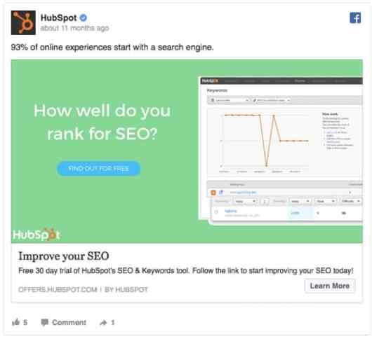
HubSpot’s used a similar approach on marketers by asking: How well do you rank for SEO? You have to click to find out.
A study from Caltech found that curiosity increases to a point where knowledge increases and then drops off. Your takeaway? Aim to give people part of the mystery, but tell the end of the story on your landing page.
#22:
Make your copy fascinating with questions.
Ask questions to create compelling Facebook ads that people can’t help but click. This ad by Cooking Love features a compelling video and the quick, imperfect but oh-so-real copy to make anyone nod along: Do you like #pancake?

Also try reinforcing the question throughout your ad. Use a similar or identical question on your video (or image), like Promo does:

#23:
Test short vs. long ad copy.
A good story isn’t necessarily a long one. The same rule applies to Facebook ads. The more clear and concise you can keep your ad copy, the greater the chance people will read it.
This Facebook ad by 99designs is certainly on the short side of ad copy:

But there are also times when longer ad copy can work. Intercom’s Facebook ad steps out of the bounds of traditional ad copy with longer copy, a minimal headline and no link description. The effect is that there’s more attention focused on the image and the single block of ad copy:

Test both shorter and longer ad copy to know what appeals to your target audience. And make sure your ad copy supports your offer, emphasizing the key points.
#24:
Eliminate all objections before they even form.
Try to eliminate common objections and risks even before they become top-of-mind. One of the reasons people change their minds about making a purchase last minute is that they come up with new objections not to make the purchase.
As Peep Laja explains on ConversionXL:
Whenever there’s a transaction, there’s risk. Usually, the vendor has the buyer carry most of the risk. If the risk seems too big, the purchase won’t take place. Offer guarantees to eliminate or reduce the perceived risks your prospects might have.
Lyft counters the objection “will I even make any money?” by offering new drivers a $500/week payment guarantee: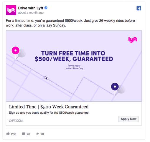
If you’re a coffee lover, Blue Bottle Coffee’s Facebook ad will win you over: it’s got a free trial. Yes, a free trial of a hard good. This neutralizes objections around having to go into the store to try the coffee out.

Moreover, the ad copy reads: Choose your coffee. Pick your frequency. Skip a shipment. Cancel whenever. Enjoy anytime. Noticed it? – Skip a shipment. Cancel whenever. That’s the perfect guarantee showing a potential buyer they’re free to cancel the subscription anytime.
Whether you’re in SaaS or ecommerce, what objections can your offer help prospects overcome?
#25:
Make the customer feel safe.
Try offering your prospects a money-back guarantee or subscription cancellation offer.
Dollar Shave Club’s Facebook ad uses a no-strings-attached strategy with this line: No commitment. No fees.
But the real value of this Facebook ad hides in the sense of belonging it creates. The Dollar Shave Club’s ad copy tells a story about an exclusive set of members who enjoy awesome benefits of using the service, making you want to belong.

According to an article in Psychology Today, the need to belong is a fundamental human need to form and maintain at least a minimum amount of lasting, positive, and significant interpersonal relationships.
By turning your product into a bigger story of community and tribes, you’ll attract more people who want to be part of something. Which brings us naturally to:
#26:
Create a feeling of a community.
Create the sense of a belonging around your product, and make all your followers feel like they’re part of a bigger cause or community.
Now, doing this doesn’t have to be intensely philosophical. It could be as simple as showing people your audience wants to befriend doing or feeling something your audience also wants. Eventbrite’s ad does this well, with colourful images of people having fun together at a relatively casual event:

#27:
Create ads that help people aspire.
Shopify uses positive language and powerfully simple words such as “dream” and “fun.”

The folks over at Buffer put together this massive list of 189 magnetic words that make your copywriting more engaging and memorable.
They also noted that the five most persuasive words in the English language are:
- You
- Free
- Because
- Instantly
- New
Keep these in mind when writing your Facebook ad copies.
#28:
Don’t be afraid to be inspirational.
Write copy that includes compelling adjectives and uncommon wording.
However, take caution not to get too carried away with nice words, forgetting about why you created the ad in the first place: to make people convert.
#29:
Keep your eyes on the success metric.
It’s incredibly important to select the right calls to action. What I mean by “right” is that your CTAs should focus not only on high CTRs but also on the end conversion.
While A/B testing Facebook ads at Scoro, we discovered that an ad with a “Sign Up” CTA outperformed an ad with a “Learn More” CTA by 14.5%. That is, “sign up” got us what we wanted most: sign ups.
Your choice of CTA depends on what you offer. This Facebook ad by Unbounce announces a new integration, making it logical to use a “Learn More” call to action.

However, when promoting their landing page tool, Unbouce clearly offers people to sign up for a free trial.

#30:
Match your CTA to expectations.
Select calls to action that match your offer. Otherwise, people might get confused when landing on a post-click page that offers, say, a download where they expected a trial sign-up.
#31:
Include customer testimonials for greater trust.
While Unbounce’s Facebook ad text promised “Our amazing tool will help you do incredible things!” there’s no real proof it actually delivers.
That’s why it sometimes makes sense to include a client’s testimonial in your Facebook ads. If you can prove that ordinary people are happy with your product, it’s a sign you’re worthy of trust.

#32:
Real people beat stock photos.
When advertising testimonials, use images of real people instead of stock photos.
Marketing Experiments found that using a real person associated with your product instead of a stock photo increased conversion by 35%.
#33:
Include fun facts and research results.
Conduct small surveys to get new interesting facts to use across your paid advertising campaigns.
Here’s an example by Grammarly:

Now let’s wrap up this list of Facebook ad hacks with my three favorites…
FAVE! Facebook ad hack #34:
Use more numbers across your ad copy.
Research shows that by starting your headline with a number, you’re 36% more likely to have people click on your ads. And it’s proven true, as far as we’ve tested it at Scoro.
SumoMe’s Facebook ad states that over 150,000 websites use their software to increase traffic. Numbers like that can help trust and validate a prospect’s interest in the offer.

FAVE! Facebook ad hack #35:
Hook your audience with odd numbers.
Outbrain collected data from 150,000 article headlines and discovered that headlines with odd numbers have a 20% higher clickthrough rate than headlines with even numbers.
That’s why we always prefer to keep our blog posts comprehensive and use headlines with odd numbers.

FAVE! Facebook ad hack #36:
Stand out with emojis.
At Scoro, we conducted a split test to see whether emojis would help increase Facebook ad click-through rates. For us, they did. Our Facebook ad headline that included an emoji had 241% higher click-through rate than the ad with no emoji.

Facebook allows you to place emojis in all parts of your ad copy:
- Headline
- Ad text
- Link description
To get started with your first emoji-ads, here’s a quick guide to using emojis in Facebook ads.
Now you’ve got 36 Facebook ad hacks to apply to your next FB ad campaign. However, no magic trick or hack can sell an offer that’s irrelevant to the target audience. So don’t forget to ensure you’ve got a good offer and audience match, before you even start to create the first ads. And to make it really easy for you to implement these tricks, we’ve worked with the crew at Venngage to put all these hacks into a single infographic you can download now.

~karola


Conversation