The DevExpress ASP.NET Bootstrap GridView (v19.1) ships with several enhancements to the batch editing feature and a new adaptive toolbar.
Batch Edit Enhancements
Our ASP.NET Bootstrap GridView control allows you to edit multiple grid rows on the client side and then send the changes to the server in a single callback. We call this feature the 'batch edit' mode. In this mode, the GridView maintains all user changes on the client side until the user saves or discards them.
Unfortunately, the Batch Edit mode was limited because it would only work for the page you were currently on. It did not allow you to page, sort, group, or perform any callback-based operation until you accepted or canceled those original changes.
Good news, in v19.1 we’ve solved this limitation. The GridView will now store your pending batch edits as you perform other callback-based operations with the control. We realized that in doing so, it could be very easy to forget those pending changes, so we have introduced a new Batch Edit preview dialog.
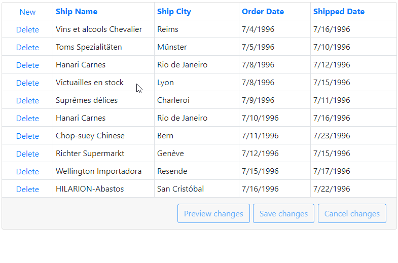
Preview Batch Changes
The new Batch Edit preview dialog allows you to see and modify, if needed, the pending insertions, edits, and deletions you’ve made, before the batched changes are saved to the data source. Take a look:
Demo
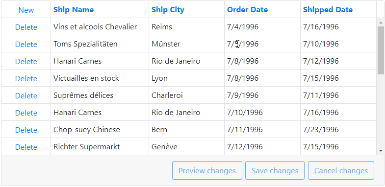
Endless Paging
We've enhanced the 'batch edit' mode with support for 'endless paging' in this release. If you're not familiar with the 'endless paging' mode, it automatically loads content as you scroll or page down:
To enable this new functionality, set the SettingsPager.Mode property to EndlessPaging:
<SettingsPager Mode="EndlessPaging" />
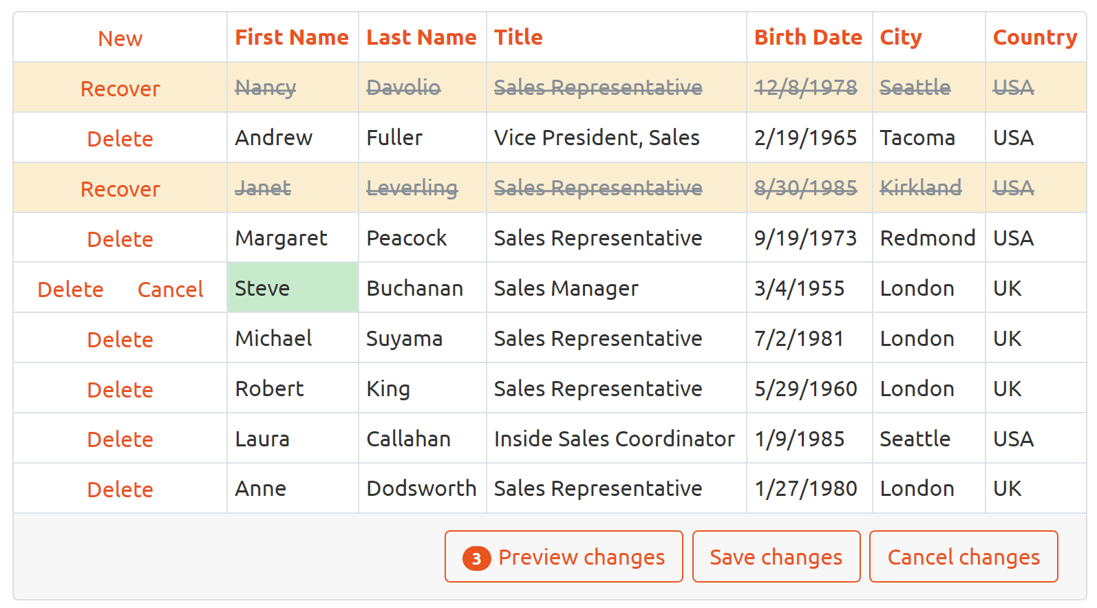
New styles for Command Buttons
The DevExpress ASP.NET Bootstrap GridView ships with three new render styles for the command buttons in batch edit mode:
- Outline (default)
- Secondary
- Danger
By default, the command buttons will use the Outline style:
Use the SettingsCommandButton.RenderMode option to change the command button style individually or as a collection:
<SettingsCommandButton RenderMode="Secondary">
	<DeleteButton RenderMode="Danger" />
	<CancelButton RenderMode="Danger" />
	<UpdateButton RenderMode="Danger" />
Callback name via EndCallback event
Our ASP.NET Bootstrap GridView's EndCallback event introduces the command name parameter in v19.1. You can now identify the operation type that has just resulted in a callback and take appropriate actions.
Adaptive toolbar
The DevExpress ASP.NET Bootstrap GridView toolbars now support adaptive layouts.
The toolbar can automatically resize, hide its items' text, and display only icons when the browser window is resized:
Demo
The BootstrapGridViewToolbar object allows you to add adaptive toolbars to different Grid View parts (inside the grid’s header/footer, outside the Panel element).
Toolbar Position
The following table lists the properties that control the toolbar's position:
|
Position = Top |
Position = Bottom |
| ShowInsidePanel = true |
The toolbar is displayed in the PanelHeader (<div class="card-header">...</div>) |
The toolbar is displayed in the PanelFooter (<div class="card-footer">...</div>) |
| ShowInsidePanel = false |
The toolbar is displayed above the Panel element (<div class="card">...</div>) |
The toolbar is displayed below the Panel element (<div class="card">...</div>) |
Note: If a Grid View has one or more toolbars in the the PanelHeader, the Grid View's
title is displayed inside the first toolbar. Otherwise, the title is displayed above the Grid View.
Toolbar Adaptivity
The following properties control how the toolbar responds when the container’s width changes:
SettingsAdaptivity.EnableCollapseRootItemsToIcons - If true, the text of all items that contain icons are hidden. You can also use the item's BootstrapGridViewToolbarItem.AdaptivePriority property to specify the order in which items are hidden.SettingsAdaptivity.EnableAutoHideRootItems - If true, the toolbar combines root items one by one in the root submenu until the toolbar contains the minimum number of root items (specified in the SettingsAdaptivity.MinRootItemsCount property).
What Do You Think?
As always, we are interested in your feedback. Please feel free to leave comments below or open Support Center tickets as required.
Free DevExpress Products - Get Your Copy Today
The following free DevExpress product offers remain available. Should you have any questions about the free offers below, please submit a ticket via the
DevExpress Support Center at your convenience. We'll be happy to follow-up.