Our Layout and Data Layout Controls can create the most sophisticated and complex UI structures – you can arrange hundreds of elements in a form or user control, split them into groups and tabs, persist and restore layouts.
These components wrap every control in a Layout Item that has its own settings to manage item paddings, margins, sizes of the hosted control and the layout item itself, sizing modes and many others. All these settings work together with the embedded control’s settings, which results in great flexibility and in some cases, considerable complexity.
In v19.1 we are introducing two special layout panels that make it easier to deal with certain common layout requirements. These panels may be familiar from WPF and many other UI platforms. They don’t have advanced functionality like runtime editing, but they provide an interesting alternative approach for some scenarios.
Table Panel
This panel is most useful when you need to arrange elements in a grid, as you typically would for data entry forms, as an example.
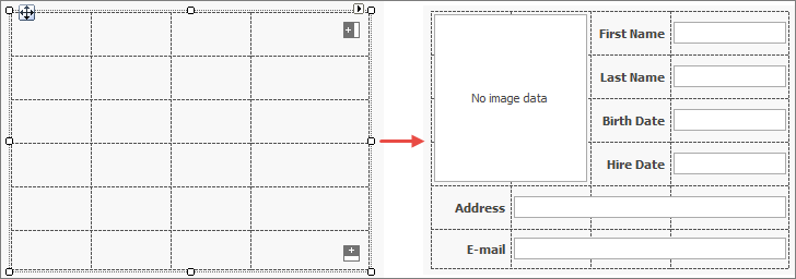
Creating the layout grid is easy. There are Columns and Rows collections, and Collection Editor dialogs to populate them at design time, as well as intuitive buttons shown in the designer (see the image above) to add items in both dimensions. Each row and column has one of three size modes:
Absolute - you specify the exact size of a column or row in pixelsRelative - column and row size values are relative to each other. If you have three rows with sizes defined as 1, 1 and 2, the first two rows will have equal height and the last one will be twice as high.AutoSize - size values are ignored, the column or row resizes to accommodate its content
When the layout grid is ready, drag and drop controls into its cells. You can drag controls between the cells to rearrange them. When a control is nested in a TablePanel, the Visual Studio Property Grid shows extender settings to change the control location and its row and column spans.
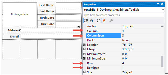
If you need to set these extender properties from code, use the Set... methods provided by the TablePanel:
// Controls must be included in the TablePanel for the
// Set... methods to work correctly.
tablePanel1.Controls.AddRange(new Control[] {button1, button2});

tablePanel1.SetCell(button1, 0, 0);

tablePanel.SetRow(button2, 2);
tablePanel.SetColumn(button2, 2);

tablePanel.SetRowSpan(button1, 2);
tablePanel.SetColumnSpan(button2, 2);
Stack Panel
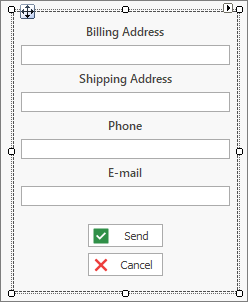
The StackPanel is similar to its namesake from the WPF world: it arranges controls in a single row or column. You can choose one of four directions: left to right, right to left, bottom up, or top down. In the image below, the panel arranges its controls top-down.
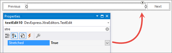
Like the TablePanel, the StackPanel accepts controls dropped onto its surface. Once added, child elements can be resized and rearranged with the mouse. There is also an extender property called Stretched, which grows a control in the configured stack direction until all free panel space is occupied or the control’s MaximumSize is reached.
StackPanels are perfect to create simple control blocks, like search panels or similar. However, you can also nest StackPanels and TablePanels to create layouts of any complexity. Populate a StackPanel, choose its direction, and drag it into a TablePanel cell - or use a TablePanel as an element in a StackPanel.
What Do You Think?
Do you like the new panels? Do you think we are missing an important feature? We would like to hear from you.
Free DevExpress Products - Get Your Copy Today
The following free DevExpress product offers remain available. Should you have any questions about the free offers below, please submit a ticket via the
DevExpress Support Center at your convenience. We'll be happy to follow-up.