TYPOP-UP
Basic rules of typography
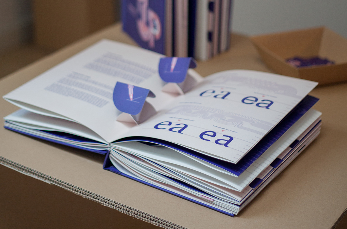
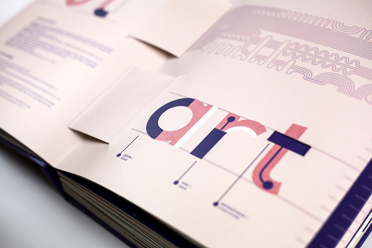
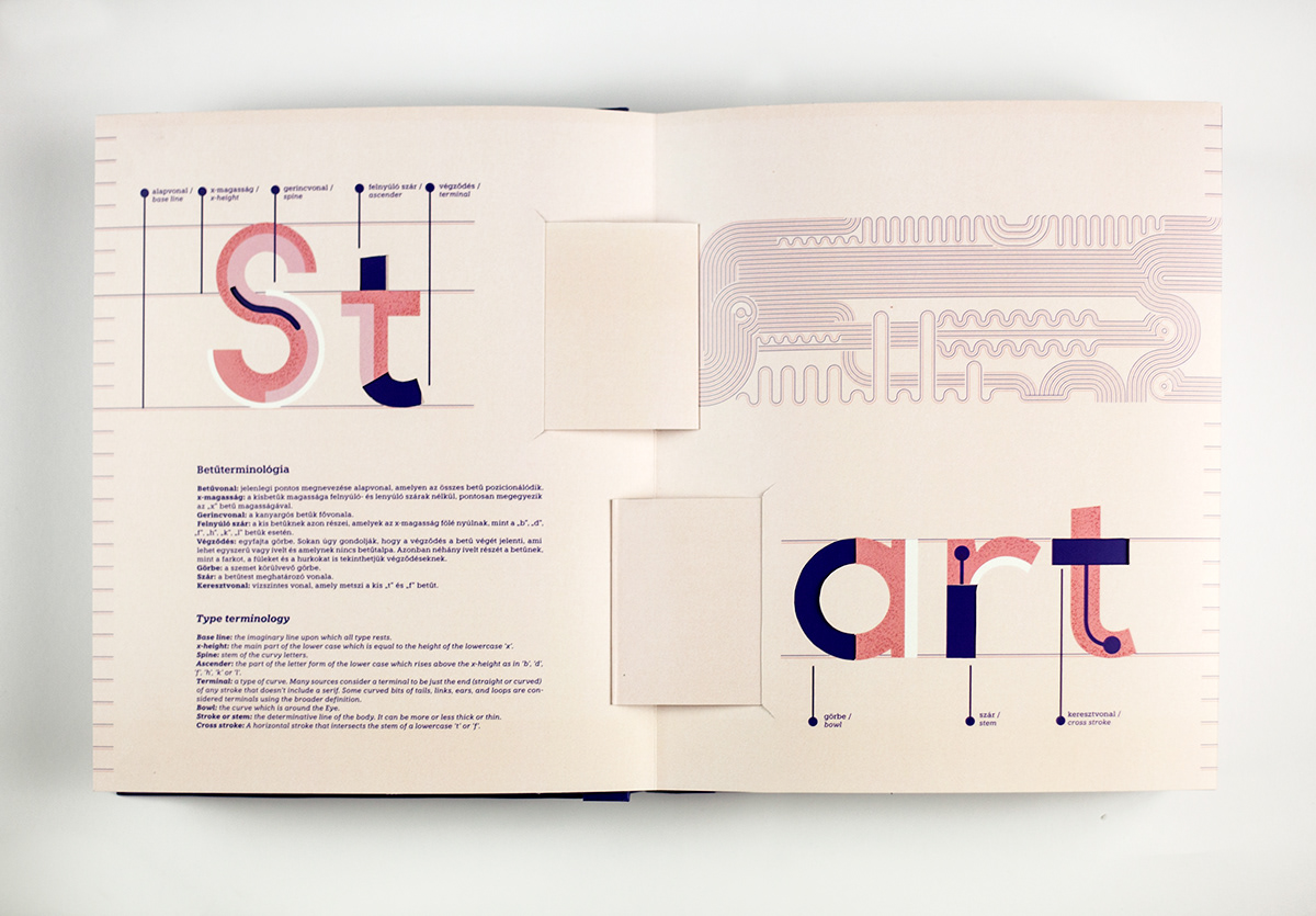
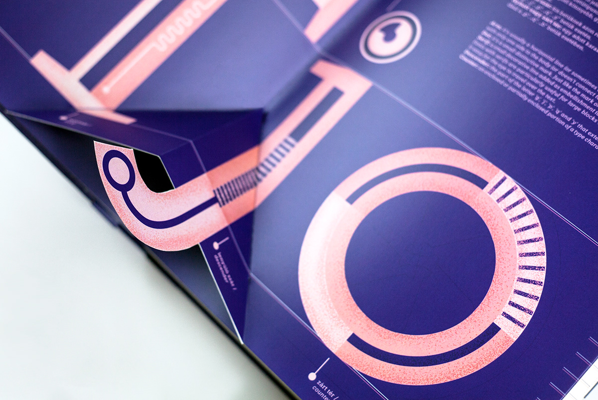
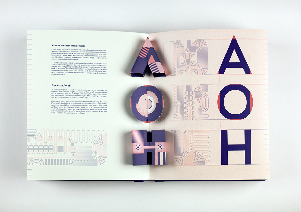
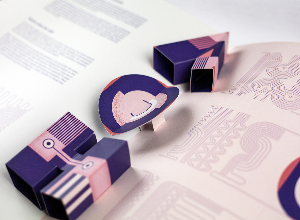
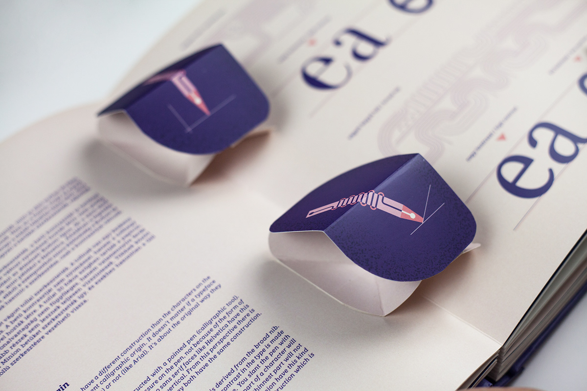
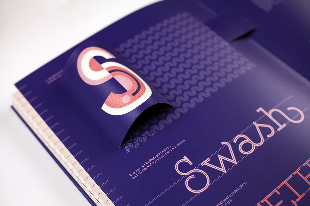
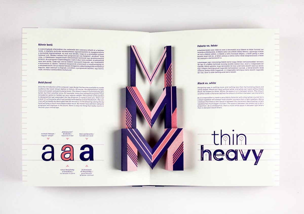
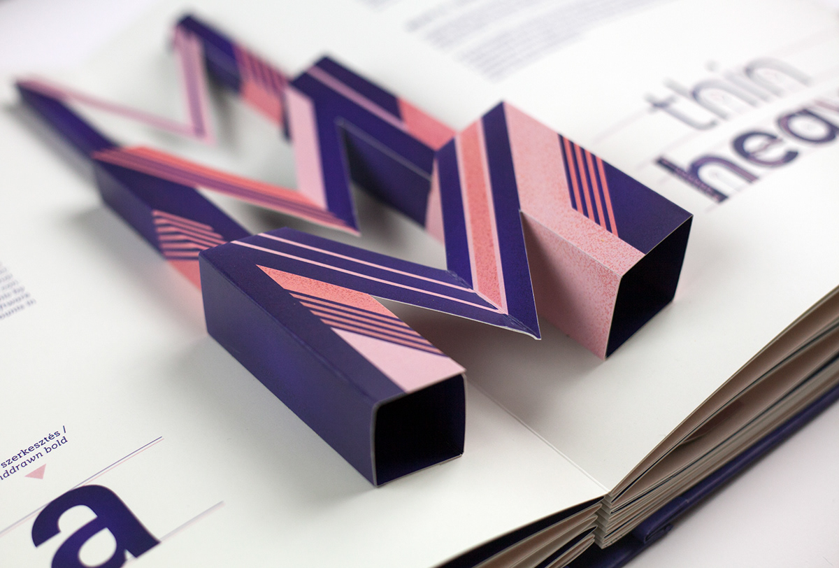
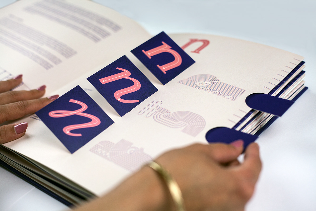
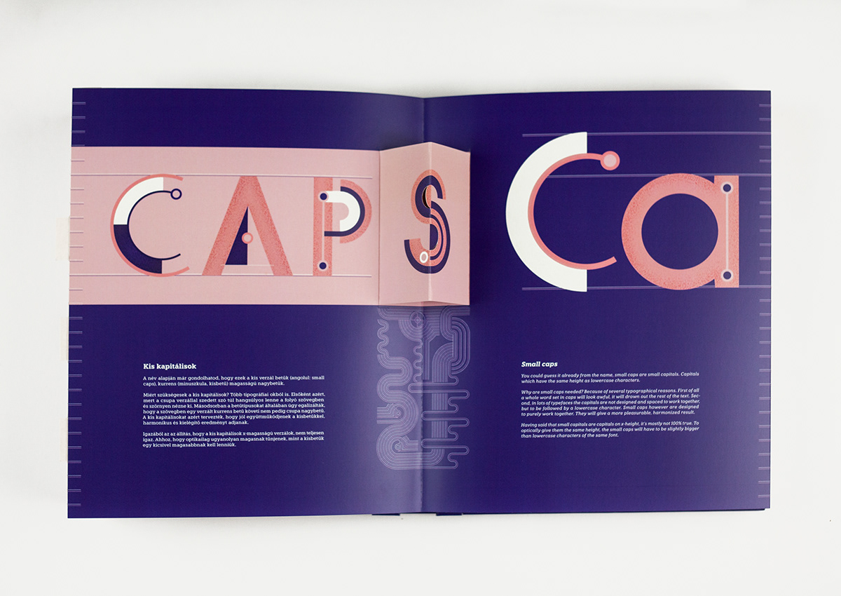
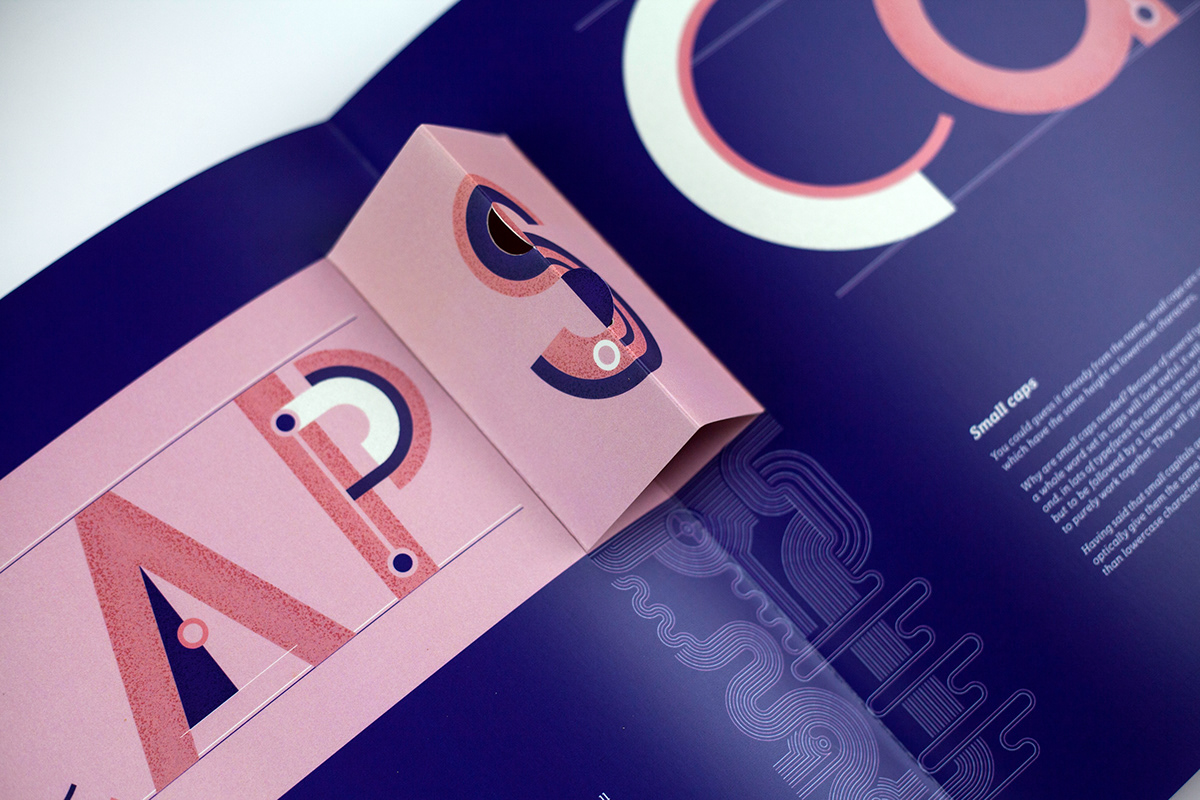
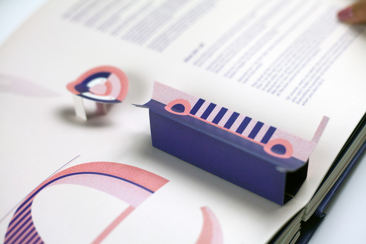
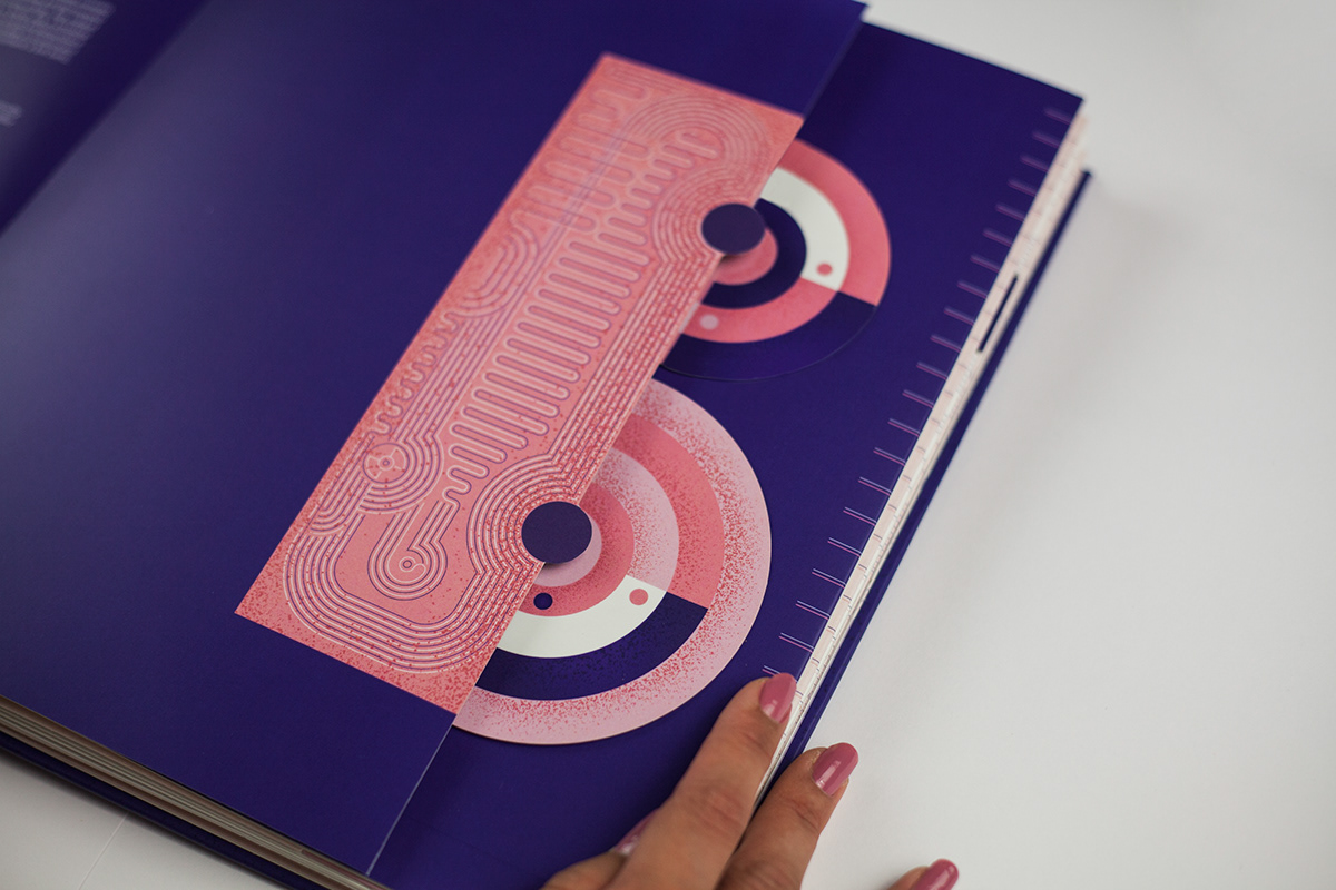
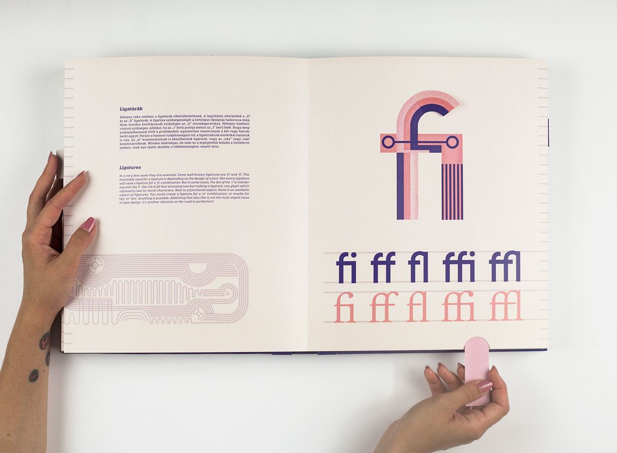
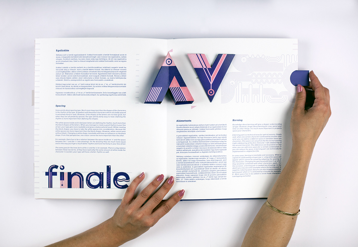
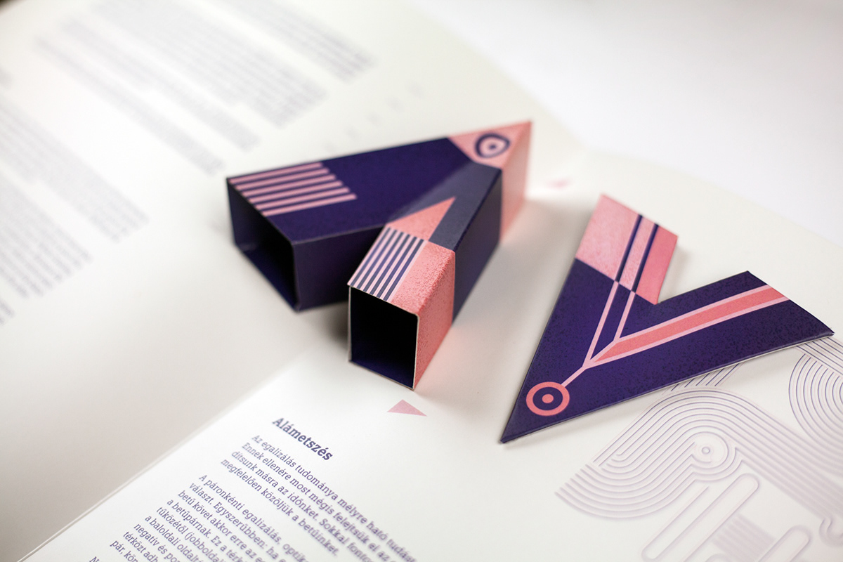
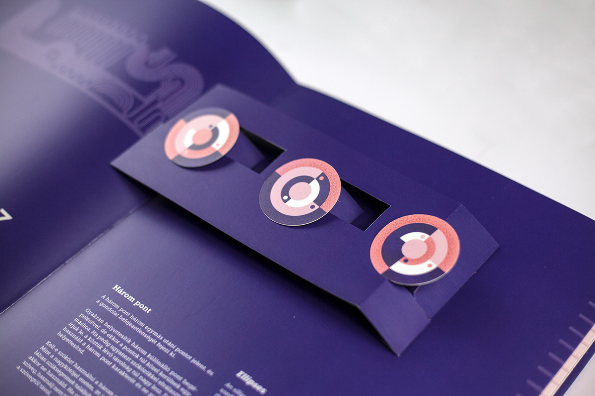
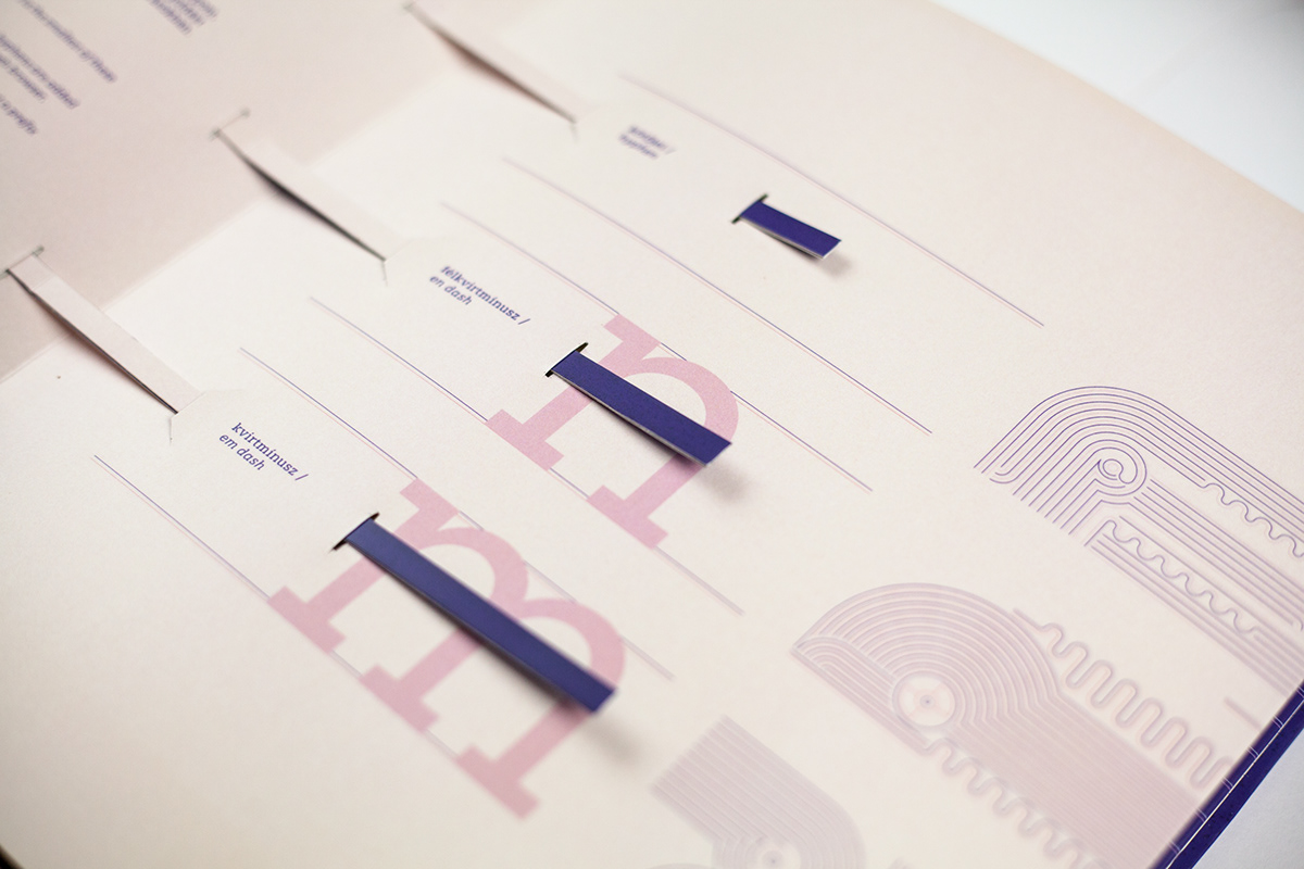
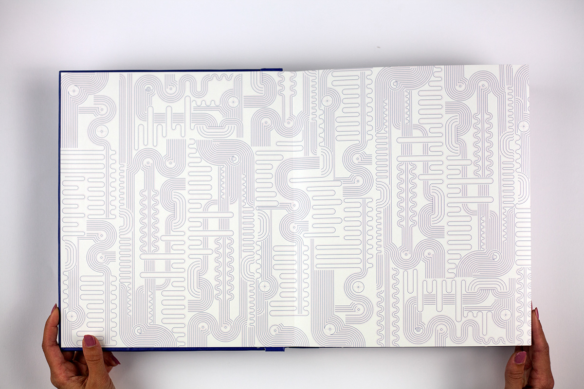
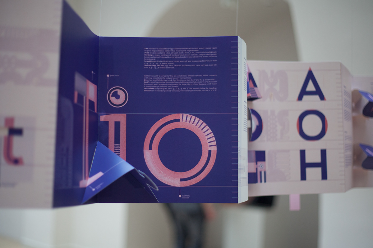
The design of an average book is two-dimensional, so it seems impossible to create movement or any spatial depth in it, except in the form of an illusion. Nevertheless, for more than 700 years, artists and book designers have tried to disprove this and push the bibliographic boundaries of the book. In my book Typop-up, in which I rely on my typographical research done during Graphic Design MA training, and on the results of my previous inquiries, I intend to present the basic rules of typography by mechanical movements. I pay particular attention to the fact that in my diploma work a movement is a true reflection of the meaning of the rule, that is, moving of those elements matters which are pointed out by the rules. In my book, I try to give as broad a picture as possible of the basics of typography, including letter terminology, optical balance, calligraphic origin, black and white spaces, italic, cursive, bold and small capital letters, mid-height, balance of forms, proportions, ligatures, egalitization, hyphens, dashes, quotation marks, and the correct use of the three points. The book’s design and illustration attempt to support the essence of pop-ups: the stratification of the paper, its spatial appearance, and the functioning of the mechanisms, all emphasizing geometric shapes.


Made at the Media and Design Department, Eger, Hungary
Graphic Design MA
Consultant teacher: Szabolcs Süli-Zakar DLA