Last month I wrote posts covering what’s new in Foundation 6 as well a deep dive into Foundation’s new menu component.
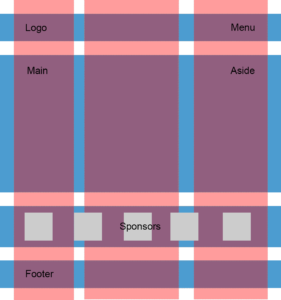
Arguably one of the best parts of Foundation is the grid system. This system is the backbone of Foundation’s responsive design and gives you the flexibility to build anything from a simple two-column layout to a multi-level deep, intricate behemoth.
The grid is based on a responsive float system, with rows, columns, offsets, clearing (the standard elements you see across several frameworks). It’s worked great and overall is a great way to get up and running quickly with your designs, catering to the various device sizes and adapting your UI accordingly.
However, there’s a new system in play in Foundation 6.
Introducing: The New Flex Grid
In Foundation 6, Zurb has introduced the Flex Grid, an optional replacement for the standard grid.
Flex Grid, as you can guess, is powered by flexbox. Instead of using floats, offset positioning, and other tricks that the standard grid employs, the new grid system lets you take advantage of some of the powerful layout features of the flexbox model.
A word of caution before you jump in head-first: Since this new grid is powered by flexbox, naturally it will only work in supporting browsers. So if you need to support legacy browsers like IE8 and IE9 you will have to stick with the standard grid.
Flex Grid is Optional
Zurb doesn’t include the Flex Grid by default; it’s an optional component. If you’re using the Sass version of Foundation, start by finding the app.scss file inside your project and open it in your editor. Inside you will see the @include statements. You will need to remove or comment out the standard grid and add the flex grid, as shown below:
// @include foundation-grid;
@include foundation-flex-grid;
If you’re not using the Sass version and instead are creating your own custom build, you can include flex grid by choosing it from the customizer and downloading your combined CSS.
The flex grid is meant to be used a replacement to the standard grid, so you can’t use both at the same time out of the box. This is because they share class names such as .row and .column.
If you want to use both, you need to employ the Sass build of Foundation 6 and define your own basic grid by using the mixin for the standard grid. This will let you define your own structure so you can keep both in the same project (for example you might call your rows .row-old and your columns .column-old).
A Basic Flex Grid Layout
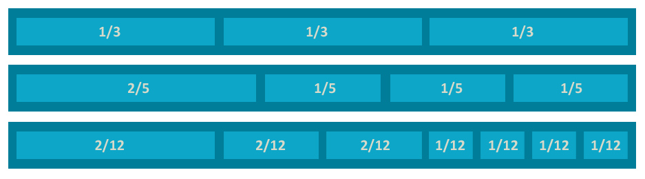
To use the new grid, you define your sections in rows and columns and add the sizing adjustments for each device profile. Here’s the basic markup for a 3-column flex grid:
<div class="row">
  <div class="column small-12 medium-6 large-4">Column 1</div>
  <div class="column small-12 medium-6 large-4">Column 2</div>
  <div class="column small-12 medium-6 large-4">Column 3</div>
</div>
With this structure, you can apply additional classes to the .row or .column elements to change your layout.
One of the great things about flexbox is how easy it is to control the ordering of elements. With standard floats it was next-to-impossible to order a series of elements one way and then to switch order based on some specified factor. With flexbox we can use the source ordering options to tell Foundation how we want our items organized.
On each column we add the order-{value} property to order each element.
<div class="row">
  <div class="column order-2">I come second!</div>
  <div class="column order-1">I come first!</div>
</div>
More usefully, we can specify the device size in which we want to re-order the elements using the {size}-order-{value}property. The size specified is used ascending, meaning if you specify small-order-1 it will be used for small, medium, large, etc.
<div class="row">
  <div class="column small-order-1 medium-order-2">
    I come first on small, but second on anything larger
  </div>
  <div class="column small-order-2 medium-order-1">
    I come second on small, but first on anything larger
  </div>
</div>
Have a look at this example demo page, which showcases how you can use the ordering property to switch up your UI based on device size.
Horizontal and Vertical Positioning
You can center things with the standard grid, but it’s often painful. Typically you need to fiddle with things or use margin tricks to get things just right. With flex grid you can easily lay out your content both horizontally and vertically.
To start, you need to add your horizontal alignment and/or vertical alignment classes to the row element. This will cause all elements in the row to be aligned as you define. If you don’t want to do that, you can add those same classes to each element to specify how each will be aligned.
To horizontally align items you need to add one of the supported alignment classes such as align-right, align-left, align-center, align-justify, or align-spaced. For example, to create an evenly spaced menu where each navigation element has a perfect amount of space around it, we can use the align-spaced class.
<div class="row align-spaced">
  <div class="column small-3">Home</div>
  <div class="column small-3">About</div>
  <div class="column small-3">Contact</div>
</div>
Because the space adds up to 9 inside the 12-column grid, we will have 3 grid units of space left, which will evenly be distributed around the items.
Vertical alignment is also super-easy to do using flex grids, which should make a lot of developers happy (considering how much of a pain it is normally). To get this running we need to add one of the supported alignment classes just like what we can do with horizontal alignment. These classes are align-top, align-middle, align-bottom, and align-stretch.
If we wanted to align all elements inside the row to be vertically centered, it’s as easy as adding the align-middle class to the row:
<div class="row align-spaced">
  <div class="column small-6">
    I am a big big column with heaps of text. My siblings will be
    positioned in the center of the row based on my height.
  </div>
  <div class="column small-6">
    I'm going to be vertically centered.
  </div>
</div>
It’s pretty cool what you can achieve using the flex grid. Take a look at this demo page if you’re keen on viewing some horizontal and vertical alignments.
A Revised Sass Grid System
The Foundation grid is the core component you build to create your responsiveness and it’s a fairly standard grid with support for different widths and layouts based on your device profile.
With each version, Zurb have tweaked the way the grid works and overall it’s pretty great. With the push to Foundation 6, they have revised their main mixin to give you more control over how you use their grid system.
Previous versions let you define how many columns your grid system will be based on, giving you the choice to either accept the default 12-column system or to choose another number that suited you. While this was great, ultimately it meant that if you want to use the grid system, you were stuck with the one grid (meaning everything will need to be defined in columns of 12, etc).
In Foundation 6, the grid mixin has been updated to let you easily define multiple grid elements, each with its own layout.
For example you can define a new layout group with 18 columns like this:
.row-listing {
  // row of 18 columns
  @include grid-row(18) {
    // primary element, used for page content
    .primary {
      @include grid-column(10);
    }
    // secondary, used for blog listing
    .secondary {
      @include grid-column(4);
    }
    // tertiary, used for side advetising
    .tertiary {
      @include grid-column(4);
    }
  }
}
This is a solid upgrade to the grid system that will help many people customize their layout exactly the way they want.
Conclusion
The Flex Grid is everything you know and love about the standard Foundation grid, just with more flexibility and control. You can adjust the ordering, horizontal and vertical positioning, along with other useful goodies.
If you can afford to cut off legacy support for ancient browsers such as IE8/IE9 then there isn’t any reason you shouldn’t be using Foundation’s new Flex Grid. It makes development much easier and will help you create really flexible layouts and designs.
Frequently Asked Questions about Foundation 6 Flex Grid
What is the Foundation 6 Flex Grid?
The Foundation 6 Flex Grid is a powerful layout system that allows developers to create complex and responsive web layouts with ease. It is part of the Foundation 6 framework, a popular front-end framework used for developing responsive and mobile-first websites. The Flex Grid uses CSS3’s Flexbox layout mode, which provides a more efficient way to layout, align, and distribute space among items in a container, even when their size is unknown or dynamic.
How does the Foundation 6 Flex Grid differ from other grid systems?
The Foundation 6 Flex Grid differs from other grid systems in its use of the CSS3 Flexbox layout mode. This allows for more flexible and advanced layouts, as it can accommodate varying screen sizes and resolutions. It also provides better alignment and distribution of space among items in a container. Additionally, the Foundation 6 Flex Grid allows for source ordering, which means you can change the visual order of elements without changing their order in the code.
How do I start using the Foundation 6 Flex Grid?
To start using the Foundation 6 Flex Grid, you first need to include the Foundation CSS and JavaScript files in your project. Then, you can start creating your grid by using the .row class for the grid container and the .columns class for the grid items. You can specify the width of each column by adding a class in the format of .small-#, .medium-#, or .large-#, where # is the number of columns you want the item to span.
Can I nest grids in the Foundation 6 Flex Grid?
Yes, you can nest grids in the Foundation 6 Flex Grid. This means you can create a grid within a grid, allowing for more complex layouts. To nest a grid, you simply create a new .row within a .columns item.
How do I align items in the Foundation 6 Flex Grid?
The Foundation 6 Flex Grid provides several classes for aligning items. You can use the .align-top, .align-middle, and .align-bottom classes to align items vertically, and the .align-left, .align-center, and .align-right classes to align items horizontally.
What is source ordering in the Foundation 6 Flex Grid?
Source ordering is a feature of the Foundation 6 Flex Grid that allows you to change the visual order of elements without changing their order in the code. This is particularly useful for responsive design, as it allows you to rearrange elements for different screen sizes. You can use the .small-order-#, .medium-order-#, and .large-order-# classes to specify the order of items, where # is the order number.
Can I use the Foundation 6 Flex Grid for mobile-first design?
Yes, the Foundation 6 Flex Grid is designed for mobile-first design. It allows you to create responsive layouts that adapt to different screen sizes and resolutions. You can specify different column widths and orders for different screen sizes, allowing for a tailored user experience on every device.
How do I create equal height columns in the Foundation 6 Flex Grid?
To create equal height columns in the Foundation 6 Flex Grid, you can use the .equal-height class on the .row. This will make all .columns in that row have the same height, regardless of their content.
What is vertical gutters in the Foundation 6 Flex Grid?
Vertical gutters are spaces between rows in the Foundation 6 Flex Grid. By default, the grid includes horizontal gutters, but not vertical ones. However, you can add vertical gutters by using the .grid-vertical class on the .row.
How do I customize the Foundation 6 Flex Grid?
You can customize the Foundation 6 Flex Grid by overriding the default settings in the _settings.scss file. This includes the number of columns, the gutter width, and the breakpoint sizes. You can also create your own classes for additional customization.
 Simon Codrington
Full stack developer and overall web enthusiast. I love everything to do with web / design and my passion revolves around creating awesome websites. Focusing primarily on WordPress, I create themes, plugins and bespoke solutions.