Introduction
The Guardian website is made up of a series of fronts and articles.

Introduction
Fronts are made up of containers — these allow stories to be grouped in a logical manner, by theme or subject matter.

Introduction
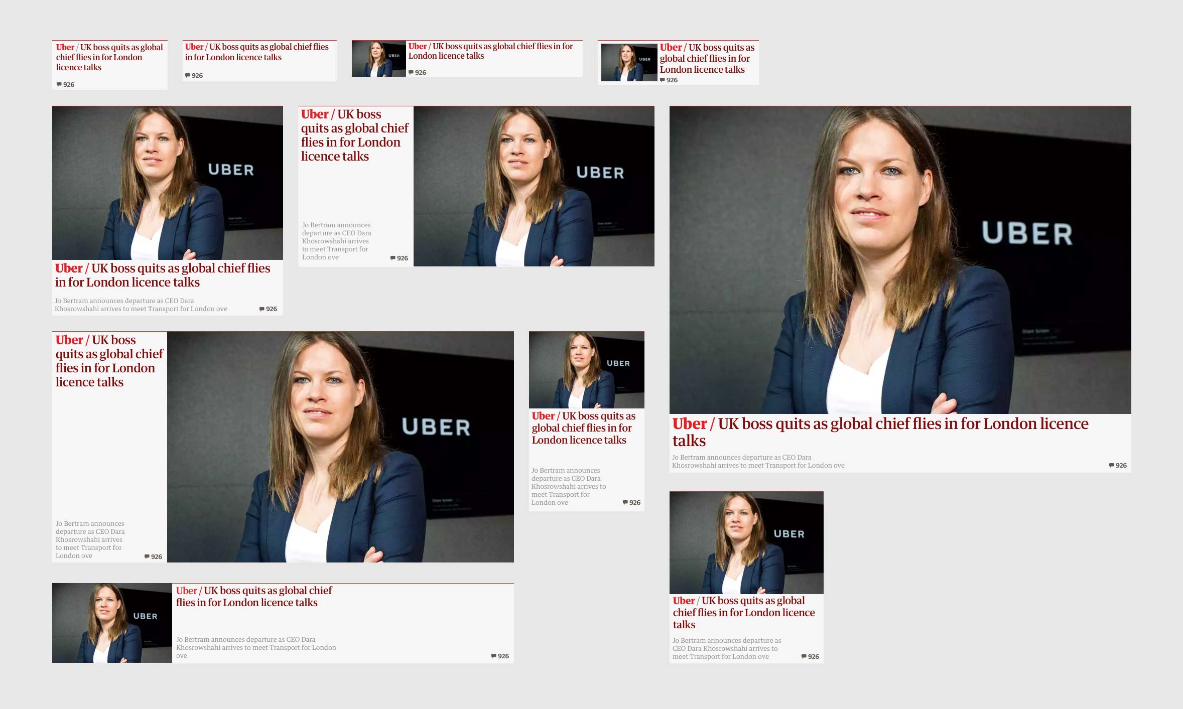
Containers are composed of modular story cards. These are designed to be flexible; they expand and contract depending on the number of stories added to them.

Introduction
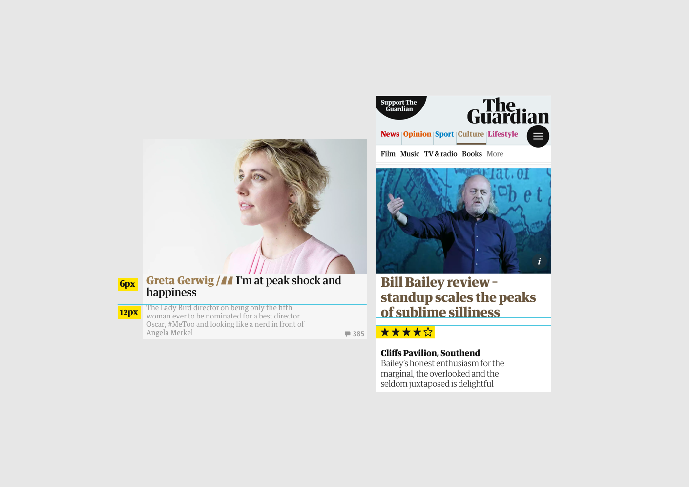
Cards can display an image, kicker, headline, standfirst and meta information.
- Kicker — Guardian Headline Bold
- Headline — Guardian Headline Medium
- Standfirst — Guardian Text Egyptian
- Meta — Guardian Text Sans

Introduction
We have a variety of different card sizes which create hierarchy and pace on the page, and allow the reader to quickly gauge a story’s importance.
Introduction
This is a selection of the card types. Each card type is designed to impart the tone of the story.

Introduction
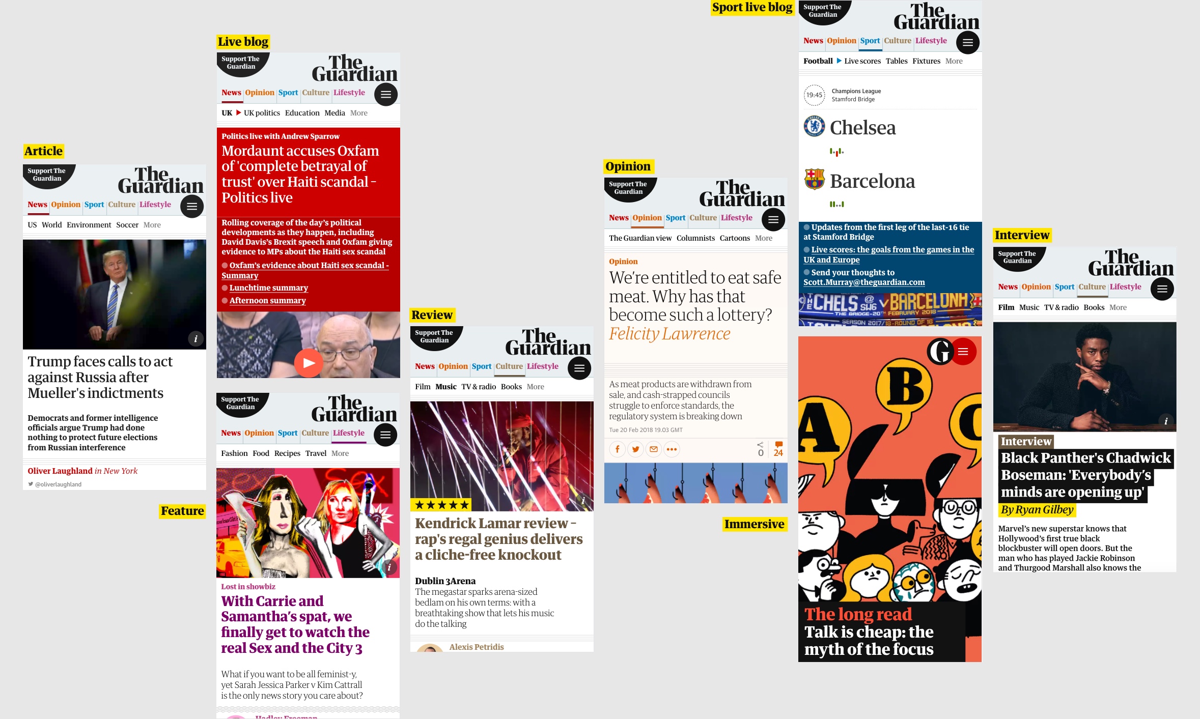
Below is a selection of the article types. Articles follow the design language of the cards, with each having its own distinct flavour and tone.
Introduction
Thrashers are custom-designed containers usually promoting a single article or series.

Grids & spacing
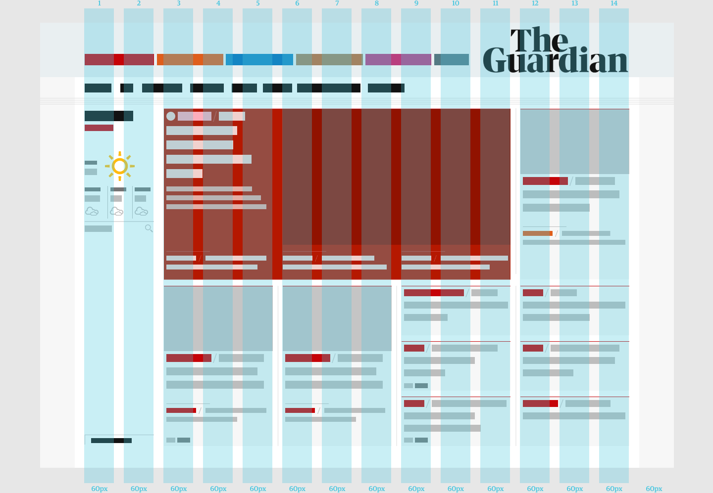
The grid provides the substrate and unifies how we arrange information on all of our digital platforms.

Grids & spacing
The desktop grid is based on columns of 60px with 20px gutters.

Grids & spacing
We use four fixed grid sizes on large screens:
- Wide — 1300px
- LeftCol — 1140px
- Desktop — 980px
- Tablet — 740px
Grids & spacing
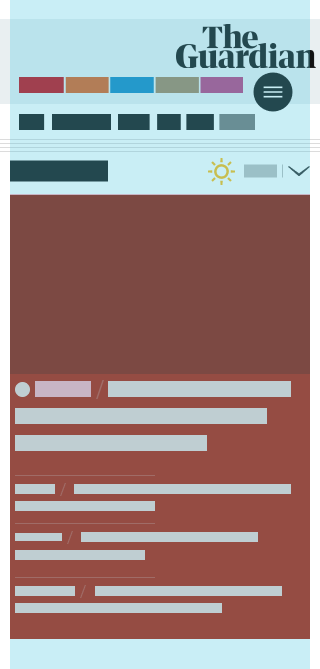
We use a fluid grid on mobile devices, with tweak points at:
- Phablet — 740px
- MobileLandscape — 480px
- MobileMedium — 375px
Grids & spacing
Spacing is intentionally used to echo the placement of the typography in print.

Grids & spacing
Rules govern the placement of display and text elements and maintain consistency across print and digital platforms.

Grids & spacing
This alignment is consistent on headlines, bylines and container titles across fronts and articles.
Brand use
The Guardian has two expressions of its brand.
Brand use
The logo and the roundel are always aligned either top right or bottom right.
Brand use
The roundel acts as a simplified expression of the brand — often used to indicate Guardian content on- and off-platform.
For more, visit The Guardian Brand hub
Typography
The Guardian has two core typefaces and three additional typefaces.
- Guardian Headline (core)
- Guardian Titlepiece (core)
- Guardian Text Egyptian
- Guardian Display Sans
- Guardian Text Sans

Typography
Guardian Headline is designed to provide an optimal reading experience across all platforms. It is used on the website and app for headlines, providing their unique character and voice.

Typography
Guardian Titlepiece was drawn from the Guardian’s logotype and is used for section titling and signposting. High contrast, bold and striking — use cautiously and appropriately!

Typography
Highly legible text type complements our display family.

Typography
We use our sans serif for small sizes or meta information.

Colour palette
Our colour palette allows us to be bold, playful, tasteful and sensitive.

Colour palette
We use colour also as a navigational aid for our readers, therefore consistency is crucial.

Colour palette
Colour is an important tool, both for our UI and for signifying the type of editorial content and the pillar under which that content sits.

Graphic elements
Various devices create hierarchy, structure and help readers to navigate.

Graphic elements
We have two styles of button. Consider weighting when choosing a style: the lozenge is bolder, the circular button is more subtle. Icons help the reader navigate and sit centrally inside an imaginary circle at the edge of the button.

Graphic elements
We use highlighting for impact and to create hierarchy and emphasis within designs.

Graphic elements
Rules provide structure and also add a subtle difference in flavour across article types. We have four styles for different parts of the website.
