


Cards brings to Xcode the card views seen in the new iOS XI Appstore.
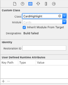
- Go to main.storyboard and add a blank UIView
- Open the Identity Inspector and type 'CardHighlight' the 'class' field
- Make sure you have 'Cards' selected in 'Module' field
- Switch to the Attributes Inspector and configure it as you like.
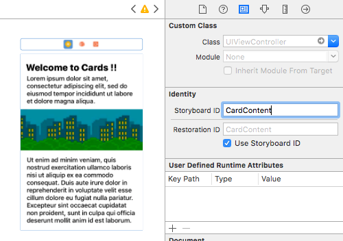
- Drag a blank UIViewController and design its view as you like
- Move to the Identity inspector
- Type 'CardContent' in the StoryboardID field.
import Cards

// Aspect Ratio of 5:6 is preferred
let card = CardHighlight(frame: CGRect(x: 10, y: 30, width: 200 , height: 240))

card.backgroundColor = UIColor(red: 0, green: 94/255, blue: 112/255, alpha: 1)
card.icon = UIImage(named: "flappy")
card.title = "Welcome \nto \nCards !"
card.itemTitle = "Flappy Bird"
card.itemSubtitle = "Flap That !"
card.textColor = UIColor.white

card.hasParallax = true

let cardContentVC = storyboard!.instantiateViewController(withIdentifier: "CardContent")
card.shouldPresent(cardContentVC, from: self, fullscreen: false)

view.addSubview(card)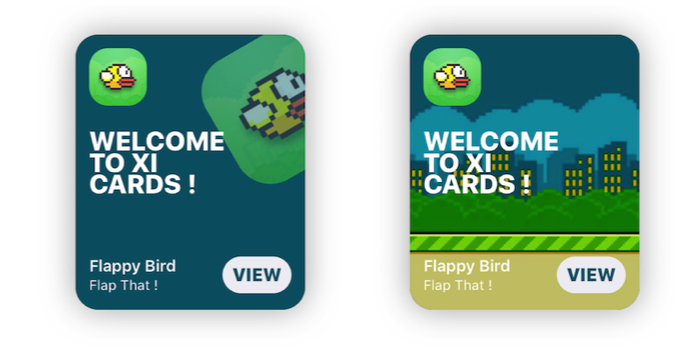
- Xcode 10.2 or newer
- Swift 5.0
use_frameworks!
pod 'Cards'- Download the repo
- ⌘C ⌘V the 'Cards' folder in your project
- In your Project's Info go to 'Build Phases'
- Open 'Compile Sources' and add all the files in the folder


//Shadow settings
var shadowBlur: CGFloat
var shadowOpacity: Float
var shadowColor: UIColor
var backgroundImage: UIImage?
var backgroundColor: UIColor

var textColor: UIColor 	//Color used for the labels
var insets: CGFloat 	//Spacing between content and card borders
var cardRadius: CGFloat //Corner radius of the card
var icons: [UIImage]? 	//DataSource for CardGroupSliding
var blurEffect: UIBlurEffectStyle //Blur effect of CardGrouplet card = CardPlayer(frame: CGRect(x: 40, y: 50, width: 300 , height: 360))
card.textColor = UIColor.black
card.videoSource = URL(string: "http://clips.vorwaerts-gmbh.de/big_buck_bunny.mp4")
card.shouldDisplayPlayer(from: self) //Required.
card.playerCover = UIImage(named: "mvBackground")! // Shows while the player is loading
card.playImage = UIImage(named: "CardPlayerPlayIcon")! // Play button icon
card.isAutoplayEnabled = true
card.shouldRestartVideoWhenPlaybackEnds = true
card.title = "Big Buck Bunny"
card.subtitle = "Inside the extraordinary world of Buck Bunny"
card.category = "today's movie"
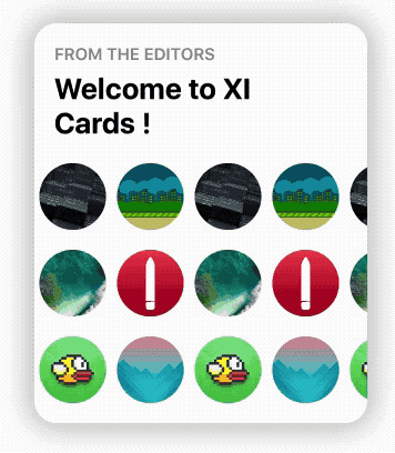
view.addSubview(card) let icons: [UIImage] = [
UIImage(named: "grBackground")!,
UIImage(named: "background")!,
UIImage(named: "flappy")!,
UIImage(named: "flBackground")!,
UIImage(named: "icon")!,
UIImage(named: "mvBackground")!
] // Data source for CardGroupSliding
let card = CardGroupSliding(frame: CGRect(x: 40, y: 50, width: 300 , height: 360))
card.textColor = UIColor.black
card.icons = icons
card.iconsSize = 60
card.iconsRadius = 30
card.title = "from the editors"
card.subtitle = "Welcome to XI Cards !"
view.addSubview(card)See the Wiki, to learn in depth infos about Cards.
GO!
If you encounter any problems or have any trouble using Cards, feel free to open an issue. I'll answer you as soon as I see it.
New features, or improvements to the framework are welcome (open an issue).
- Patrick Piemonte - providing Player framework used in CardPlayer.swift
- Mac Bellingrath
Cards is released under the MIT License.