How calc() Works
The CSS3 calc() function allows us to perform mathematical operations on property values. Instead of declaring, for example, static pixel values for an element's width, we can use calc() to specify that the width be the result of the addition of two or more numeric values.
.foo {
    width: calc(100px + 50px);
}
Why calc()? #
If you have used CSS pre-processors like SASS, the above example is something you may have come across.
.foo {
    width: 100px + 50px;
}

// Or using SASS variables
$width-one: 100px;
$width-two: 50px;
.bar {
    width: $width-one + $width-two;
}
However, the calc() function provides a better solution for two reasons. First, we can combine different units. Specifically, we can mix relative units such as percentages and viewport units, with absolute units such as pixels. For example, we can create an expression that will subtract a pixel value from a percentage value.
.foo {
    width: calc(100% - 50px);
}
In this example, the .foo element will always have a width that is 50px less than 100% of it's parent width.
Second, with calc(), the computed value is the expression itself, not the resulting value of the expression. When doing mathematical expressions with CSS pre-processors, the value given to the browser is the resulting value of the expression.
// Value specified in SCSS
.foo {
    width: 100px + 50px;
}

// Compiled CSS and computed value in browser
.foo {
    width: 150px;
}
However, with calc() the value parsed by the browser is the actual calc() expression.
// Value specified in CSS
.foo {
    width: calc(100% - 50px);
}

// Computed value in browser
.foo {
    width: calc(100% - 50px);
}
What this means is that the values in the browser can be more dynamic, and adapt as the viewport changes. We can have an element with a height of the viewport minus an absolute value, and it will adapt as the viewport changes.
Using calc() #
The calc() function can be used to perform addition, subtraction, multiplication, and division calculations with numeric property values. Specifically, it can be used with <length>, <frequency>, <angle>, <time>, <number>, or <integer> data types.
Here are a few examples -
.foo {
    width: calc(50vmax + 3rem);
    padding: calc(1vw + 1em);
    transform: rotate( calc(1turn + 28deg) );
    background: hsl(100, calc(3 * 20%), 40%);
    font-size: calc(50vw / 3);
}
Nesting calc()s #
calc() functions can be nested. Inner functions, however, will be treated as simple parenthesised expressions. Take, for example, the following nested expression -
.foo {
    width: calc( 100% / calc(100px * 2) );
}
The computed value of this function will be as follows -
.foo {
    width: calc( 100% / (100px * 2) );
}
Providing a Fallback #
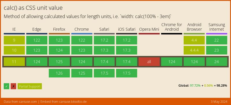
The support for calc() is relatively widespread.
For browsers that don't support calc() as a value, the entire property-value expression is ignored. This means that we can easily provide a fallback static value that will be used by non-supporting browsers.
.foo {
	width: 90%; /* Fallback for older browsers */
    width: calc(100% - 50px);
}
When can we use calc()? #
The calc() function can be useful in a variety of situations.
Example 1 - Centering Elements #
Using calc() provides us yet another solution to the age-old problem of centering elements horizontally and vertically within a container. If we know the dimensions of the child element, a typical solution is to use negative margins to shift the element by half it's height and width, like this -
// Assuming .foo is 300px height and 300px width
.foo {
    position: absolute
    top: 50%;
    left: 50%;
    marging-top: -150px;
    margin-left: -150px;
}
Using the calc() function, we can achieve all of this using only on the top and left properties.
.foo {
    position: absolute
    top: calc(50% - 150px);
    left: calc(50% - 150px);
}
With the introduction of Flexbox, methods like this are less likely to be needed. However, in cases where Flexbox can't be used, e.g. if the element needs to be positioned absolutely or fixed, this method can be useful.
Example 2 - Creating a Root Grid Size #
The calc() function can be used to create a viewport-based grid out of the rem unit. We can do this by setting the root element's font-size to be a fraction of the full viewport width.
html {
	font-size: calc(100vw / 30);
}
Now, 1rem will correlate to 1/30 of the viewport width. For any text on our page, this means that it will be automatically scaled based on the viewport. Further, given the same dimension of viewport, the same amount of text will always be on the screen no matter the actual size of the viewport.
If we size other non-textual elements on the page using rem units, they will also follow this behaviour. An element with a width of 1rem will always by 1/30 of the viewport width.
Example 3 - Clarity #
Finally, calc() can be useful for making any calculations being done more obvious. For example, if you want a group of items to be 1/6th the width of their parent container, you could write it like this -
.foo {
	width: 16.666666667%;
}
However, it would be much more clear to people reading the CSS to write -
.foo {
	width: calc(100% / 6);
}
There are many more things we can do with calc(), such as creating a Grid System. It's definitely one of the most useful newer features in CSS.