Introducing a New Look for The Atlantic
A conversation with the magazine’s creative director, Peter Mendelsund, about our bold new design
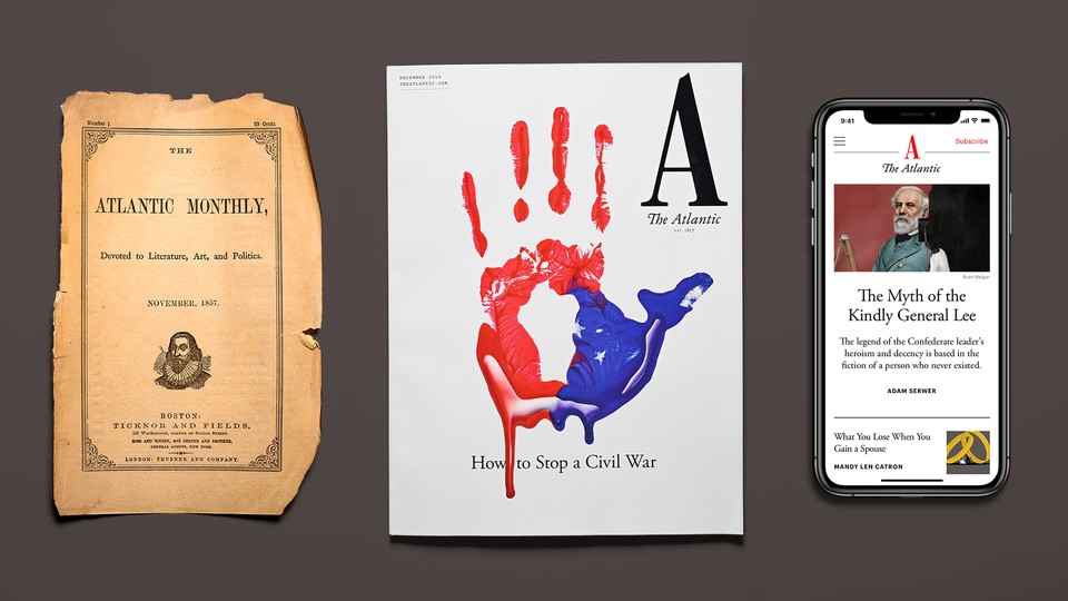
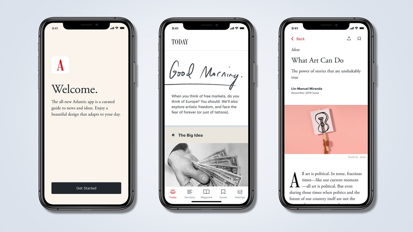
Today, we launch our December issue, built around a single theme: “How to Stop a Civil War.” This issue, an exploration of our dangerous political moment, also represents the debut of a new visual identity for The Atlantic. It is the most dramatic new look for our magazine in its 162-year history, and one that, we hope, reflects boldness, elegance, and urgency. The redesign of the print magazine, as well as the new look of our website, was led by Peter Mendelsund, our creative director. His design work, carried out in collaboration with many teams across our magazine, is also reflected in the new Atlantic app that launched today. I sat down with Peter to talk about the new design, his creative process, and how his work was informed by the history of our magazine.
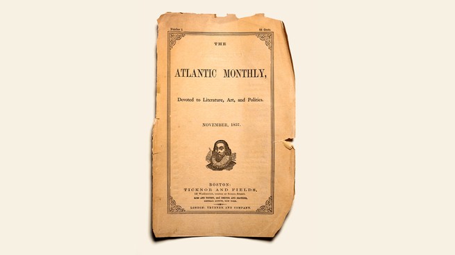
Jeffrey Goldberg: The first issue of The Atlantic was published in November 1857. How do you, as the creative director of a 162-year-old publication, use history without being burdened by history?
Peter Mendelsund: The interesting thing to me about the first cover in 1857 is how clear the hierarchy of information is. The forthrightness, the omitting of needless information, the seriousness of purpose and mission—I would say those are all components of the design that represent what The Atlantic, as an institution, does well.
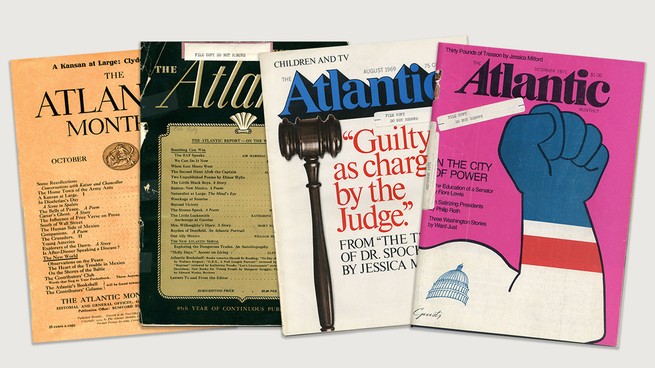
Even though our journalistic principles haven’t changed over the years since that first issue, our look has been all over the map, a chaos of signifiers and various styles. There is a 20-year period, between 1929 and 1949, in which we redesigned the magazine five times.
That constant chopping and changing alleviates some of the pressure on me and my team, because—to use a phrase from start-up culture—we’re just iterating on some level. And hopefully improving! But I did want to stem the tide. I thought that if we returned to first principles, we could do something that would, hopefully, last a little longer.
Goldberg: One of the first things you did when you got to The Atlantic was dive into the archives.
Mendelsund: Because the design has changed so often, you get an amazing flyover of the history of short-lived vernaculars of 20th- and 21st-century design. For instance, in the early part of the 20th century you see all of these type-only constructions, covers as tables of contents, and then in the 1920s and ’30s you see classical deco typography and art and design. Jumping forward quite a bit, in the late ’60s and ’70s you get the bubble type and a sort of funky, “At the Carwash”–style Atlantic. Some of my favorite covers are from the ’60s and ’70s, when we really just focused on a single image and a simple headline. We’ve also gone through periods of what I would call design maximalism, where we were just trying to put as much information on the page as possible.
Goldberg: Is that maximalism or accretion?
Mendelsund: It’s both. You have these ornaments and rule sizes and type conventions that aren’t serving a function anymore, but sort of stick around. And before you know it, the page is this kind of hodgepodge.
If we wanted every issue to be a genealogy of The Atlantic, then we could continue on that same course—but we don’t. We want the reader to be able to focus on what they’re reading, and we want the art and photography to be able to amplify that experience rather than distract from it.
Goldberg: The most notable change in this redesign is the new nameplate, the move to the A as representative of the whole. When you first raised this idea to me, I was, if you recall, surprised by the drama of it, and also surprised that I liked it.
Mendelsund: When Oliver Munday, my senior art director, and I began rethinking the wordmark, we tried a number of angles, mainly finding ways to repurpose and redraw old marks from The Atlantic’s past. But the notion occurred to us that we would eventually need a mark that wouldn’t be so horizontal; in other words, a mark that wasn’t a word, such that it could fit in all of those confined spaces where, physical magazine aside, The Atlantic lives. Like on your phone, and on your social-media feeds, etc. It seemed obvious to us that what we needed was an emblem—a logo. A “swoosh,” if you will. But what could that logo possibly be? At some point, we noticed that we had already been clicking on that very logo, every time we went to The Atlantic online, or on the app, or on Twitter—that is, a giant A. There it was, staring us in the face. And the more we explored The Atlantic’s long history, the more we saw that A, Zelig-like, showing up. Which is to say that, although the A seems radical, it is in fact historically grounded. Like The Atlantic itself.
/media/img/posts/2019/11/160ForPeter/original.gif)
Goldberg: Tell me about Atlantic Condensed, our new typeface.
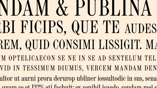
Mendelsund: Atlantic Condensed is the typeface that we commissioned based on the type forms that the founders chose for the first issue. We looked through original issues and at type foundry specimens from that time. The founders chose a typeface that’s very condensed—which is good, because it means you can fit more type onto the page. They also chose one that’s generally used in its capitalized form—which is also good, because it means that you can easily signal that something’s important. It is a serif typeface, and what’s known as a “Scotch” face, which describes the way the serifs are designed. It is an extremely legible, classical kind of typography, but also transmits a certain kind of vehemence and urgency that works nicely for our contemporary purposes.
Goldberg: What were your north stars when you started working on the design?
Mendelsund: I come to this work at The Atlantic primarily as a reader. And the things that were interesting to me as a reader were those designs that could best suit the language on the page. I wanted the design to be readerly. And I wanted it to feel confident. And, again, I wanted to make pages that weren’t clamoring for your attention in too many ways—that allowed you to enjoy that one-to-one experience, reader-to-writer.
I think that’s accomplished in a number of different ways. One is through good grids, making sure that the page itself has a rigorous, almost Euclidean logic to the way it’s laid out. Another is by ensuring that the type is interrupted as little as possible, and that when it is interrupted by imagery, the imagery is contained within its own cordoned-off space. I really wanted to frame our images so that they weren’t full bleed—they didn’t go off the edge of the page. The idea of imagery in magazines for decades now has been that bigger is bolder. But I find that when a picture has a frame around it, it allows you to focus more on the thing itself. And the primary job here was to make sure that the reading experience was vibrant, interesting, and less interrupted.
Goldberg: Tell me about your theory of cover design.
Mendelsund: I would say that a cover can accomplish, maximally, three things at once. As soon as you try to make more than three moves in any visual space, there’s a real diminishment of effect. What are those three things? With a magazine cover, what you really want to do is push the fact that you’re reading a particular magazine. So that’s the branding aspect. Then you want something vibrant and attention-grabbing, which will represent the cover story, or the issue as a whole. And then in most cases you want room for the typography that will push whichever other stories you decide to add to that space. But you really have to choose very carefully what it is you want to say and to decide which elements are doing the saying—for example, whether the image is doing the heavy lifting or the typography is—and then make sure all of the elements are in their proper proportions.
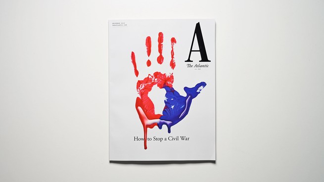
Goldberg: On the “How to Stop a Civil War” cover, I think it takes a moment to realize that the handprint is also a map of America. There are levels to it, like any good piece of art.
Mendelsund: My favorite kind of design is a kind of time-released design, where you look at something and you have an immediate impression of it, and then you, upon further reflection, find something in the design that adds to or subverts that first impression. For a cover as important as this one, to inaugurate this redesign, I thought it was important that we not crowd out interpretation, but rather invite it. We wanted the cover to transmit, obviously, the notion of the nation itself, and also some sense of a hand being stuck up to say “Stop.” There is something both metaphorically and literally arresting about the image. The operative word in the headline here is Stop. We all recognize that we’re in a particularly perilous moment in American culture and politics, and The Atlantic is not a magazine that tiptoes around difficulty. We thought of this issue as being really a bracing kind of wake-up call.
Goldberg: When did the image of Poseidon, used in countless colophons over the years, first come in to our pages?
Mendelsund: The first version, the engraved colophon, was printed on the cover starting in 1910. Like the rest of the magazine, Poseidon has gone through a lot of transformations. When the magazine started using big color images on the cover, in 1947, an illustration of Poseidon by the designer W. A. Dwiggins was featured on the first redesigned issue. There was a variation in the ’80s where he gets a tan and some more defined muscle tone. When the editors sought a return to the magazine’s design “roots” in 2001, they revived the original engraving.
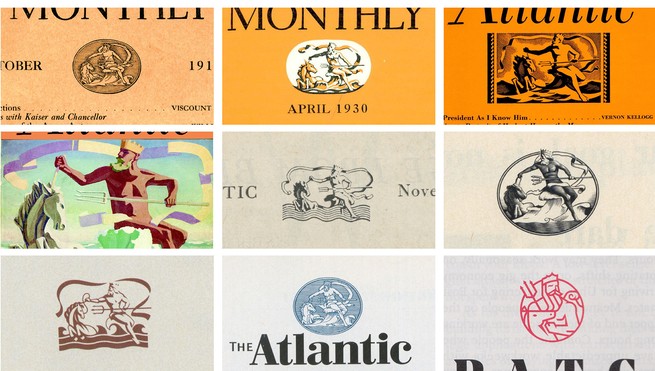
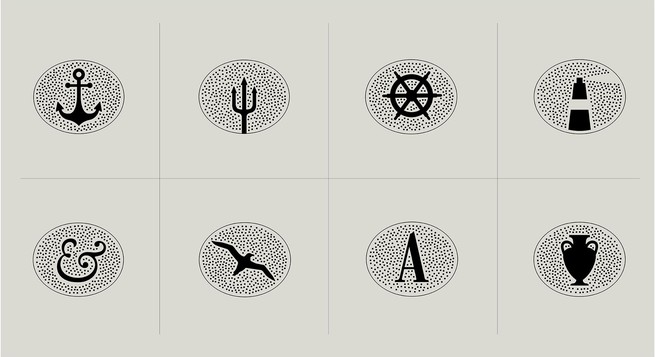
When Oliver and I first encountered Poseidon in its modern form, we both looked at it and thought, Who is Poseidon, and what has he to do with this whole endeavor? Only when I later saw the engraved version of Poseidon did I realize that it wasn’t important who Poseidon was in this context—aside from being a general nautical signifier—but rather that the engraving itself signified “old.” In other words, the medium was the message. The old Poseidon told the reader that The Atlantic had been around a long time. We made a whole ecosystem of “engraved” nautical emblems to serve as visual interest on the page, on the website, and so on. Poseidon is just one of many. And the style of these emblems, we hope, signals a kind of historically informed classicism.
Goldberg: Why did you want to include the established date on the cover?
Mendelsund: I think what it came down to for me was just my own personal surprise at not knowing that incredibly rich history, not knowing who the founders were, never having read the original manifesto. And just wanting to have other people have the same experience that I had—to have that joy of discovery.
/media/img/posts/2019/11/Splash/original.gif)