An Intro to Git and GitHub for Beginners (Tutorial)
New to git? Follow the steps below to get comfortable making changes to the code base, opening up a pull request (PR), and merging code into the ...
 When we set out to build the new and improved Website Grader, we wanted something that would be slick, speedy, and powerful. First impressions are everything so creating that look and feel on the homepage was paramount. A key component in making that happen was building an engaging form (the two input fields where users enter their website and email address). This form is the only interactive component on the homepage, and more importantly, the only way users can start using the tool.
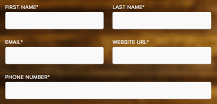
So, to get that quick and clean feel, we ended up building an animated form. Here's why. Most forms look like the one below with blank input fields and corresponding labels like 'First Name' and 'Last Name'. These work well but the fields and labels remain pretty static as users enter their information and navigate through the form.
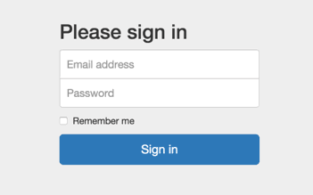
Using placeholder text instead of labels (like 'Email address' and 'Password' in the example below) creates a slightly more dynamic experience since the prompts disappear when users start typing. But this approach still isn't ideal. Even though using placeholder text instead of labels makes forms shorter, it can also make it harder for users to navigate through the form.
We considered the benefits of both approaches and decided to build our own animated form for Website Grader (below). In this form, the input fields contain text placeholders at first and then when a user clicks on a field, that text transforms into a label.

We used an animated label to first act as a placeholder and then transition into a label when required (e.g. when the input element contains a value). Here's a step-by-step tutorial so you can create a dynamic form like the one above:
First thing's first: we need a label and an input field (let's worry about styling later):
Notice how the label actually wraps the input field. With this method, we no longer have to rely on the HTML ‘for’ attribute. If we click anywhere inside the label (specifically, on the div element that contains the label text), focus will switch to the input field automatically. You'll also notice how the label-text element is after the input field in the DOM. This is so we can take advantage of the CSS adjacent sibling combinator to select our new “label” (this will be useful when the input field is active).
Next, let's move the label text over the input field and then move it above when the input has focus:
At first, the label looks like a standard text placeholder. But when focus shifts to the input field, the text moves above it and acts as a label. Simply put, we use the CSS style 'transform: translateY' to move the position of the text vertically.
Font plays an important role in making any application sleek, so let’s clean that up a bit:
Now, the font size will change from large placeholder text to small label text when the input has focus. We’ve also increased the letter spacing and forced uppercase on the label. Let's use Google Font’s Open Sans to punch up the text a bit, too.
Now, the input field border interferes with the label which looks a little odd. Let’s spruce that up:
Most of the changes here are style related. To summarize, we:
You might notice that the label jumps during transformation from one state to another, and so does the input width. We can fix that by using CSS transitions:
The interaction with the input field should feel a lot smoother now. For simplicity, I applied ‘transition: all 0.3s’ to both the input and the label text, but you can target specific properties and change the timings however you please (example).
We're almost there. One issue still remains, though. If a value is entered and focus is taken off the input field, the label returns to its original position covering the inputted text:

We need a way to detect if a value exists and if it does, stop the label from moving over the input field. Unfortunately there isn't a clean CSS solution; there is, however, a solution. By adding a ‘required’ attribute to the input field, we can utilize the CSS ‘:valid’ pseudo class. That way, whenever a value exists in the text field, it will appear valid and we can trigger some different styling:
There are cases where this solution doesn’t work and in those cases you can use JavaScript to listen to certain events (e.g. onblur) and act accordingly (by adding specific CSS classes - see an example here).
To complete the component, let’s wrap everything up in a form, add another labeled input field, and include a clean call-to-action:
Now we have a sleek, animated form with responsive fields. If you have any questions about the tutorial, let us know in the comments and if you want to read more about Website Grader and why we built it, check out this post.
Thank you to Brad Frost (whose floating label design was a big inspiration), Hugo Welke (the talented HubSpot designer who brought Website Grader to life), and Francisco Dias (our resident CSS maestro and the peer-reviewer on this post).