There are many different ways to handle accidental “clicks” on touch devices. In this article, we’ll review the three most predominant strategies.
During our mobile e-commerce usability testing, users would often accidentally “click” items on the page — typically when they were using their finger for reading assistance, adjusting their grip on the phone, or when intending to scroll (or had just scrolled).
Now, sometimes those accidental “clicks” throughout the webpage didn’t matter because the user didn’t happen to hit any buttons or links. Yet other times it had dramatic consequences, with users accidentally submitting forms prematurely or leaving pages they wanted to stay on. In a few instances, it even led to abandonments because the test subjects inadvertently got sent far back in their process and they simply became too frustrated to continue (this mostly happened when data loss was involved).
The first step to handling accidental “clicks” on touch devices is naturally to avoid them in the first place. This is best done by carefully considering the different hit area sizes and placements in your user interface — topics that have been written about exhaustively already. Instead, this article will focus on how you can gracefully handle these accidental “clicks” when they do occur (which they frequently did during our usability testing, even when hit areas had been carefully designed).
There are different strategies to handling accidental clicks, some of which are a lot more elegant (but often also technically more challenging) than others. The three primary strategies are:
- “Too Bad” — Nothing is done and the accidental “clicks” are simply accepted. The downside is obvious: accidental clicks aren’t actually handled, meaning that some users will have unintended actions occur with no immediate option for recourse.
- Demonstrate Intent — The user must explicitly show their intent by, for example, confirming their action in a dialog, pressing and holding a button, or some similar advanced interaction. The downside of this strategy is that all users are taxed with increased UX friction.
- Reversibility — Allowing users to “undo” their action, or “edit” the outcome of it, after the fact. This enables unfortunate users to revert accidental “clicks” without taxing everyone with a slower and more complex UI. The main downside of this strategy is the technical (and logical) challenges it can bring about.
In this article we’ll dive into and exemplify the various designs of each of these three strategies, review “when it is appropriate to do what,” and discuss how the strategies may be combined.
(For a beginner’s introduction to UX, start with our primer, UI vs UX.)
Strategy #1: “Too Bad”
There’s always the option to do nothing and simply allow the accidental clicks to happen without options for recourse. For high-severity actions it’s obviously an unacceptable strategy because of the high UX cost it imposes on those unlucky users who accidentally “click” an option or happen to pick the wrong one in a moment of inattention.
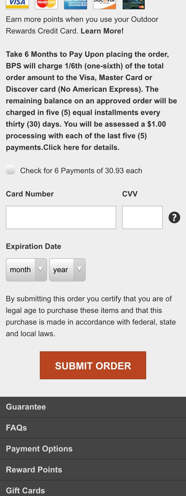
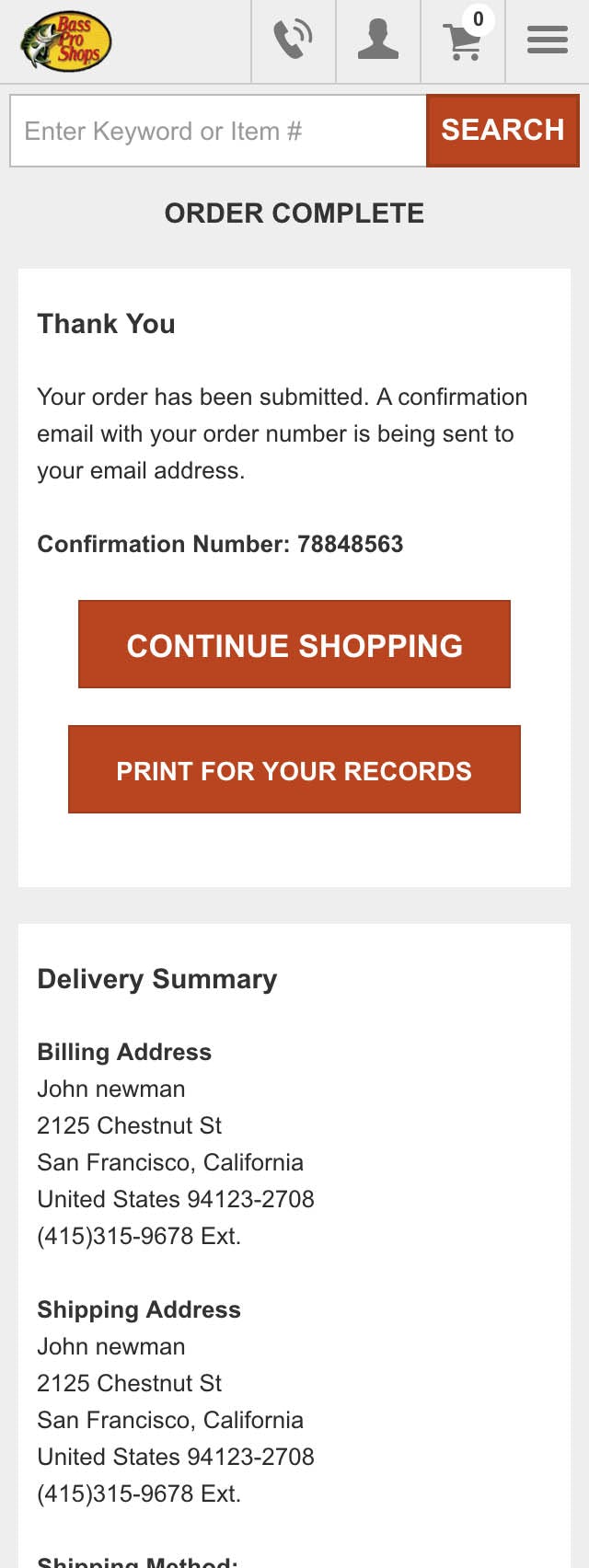
The mobile checkout at Bass Pro Shops doesn’t have a “Review Order” step and doesn’t allow users to easily edit their order on the “Order Confirmation” page. Consequently, a single accidental click on the “Submit Order” button on the checkout page will require serious effort from the user to remedy.
It’s important to realize that the cost of accidental clicks can be very high for certain actions such as “Delete”, “Send”, or “Pay”. Therefore, even if it only happens to a few users, the severity can be very high when it does occur, and thus potentially worth the extra effort required to handle those scenarios.
That said, there are circumstances in which the “too bad” strategy can be perfectly fine. For example, if an action is non-critical (and especially if it must be repeated often), such as archiving files or moving tasks to another list, it may be more attractive to simply accept the actions rather than slowing down or complicating the user interface — assuming that “Undo” (see strategy #3) is cost prohibitive.
Strategy #2: Demonstrate Intent (or “Are You Sure You Want to Do That?”)
One way to make sure users indeed intended to perform the action they invoke is to ask them to confirm it. This is often easy to implement and at least prevents the truly accidental clicks, although they don’t always catch the momentarily absentminded user who may continue in autopilot mode and thus be prone to simply accepting the classic “confirm” dialog.
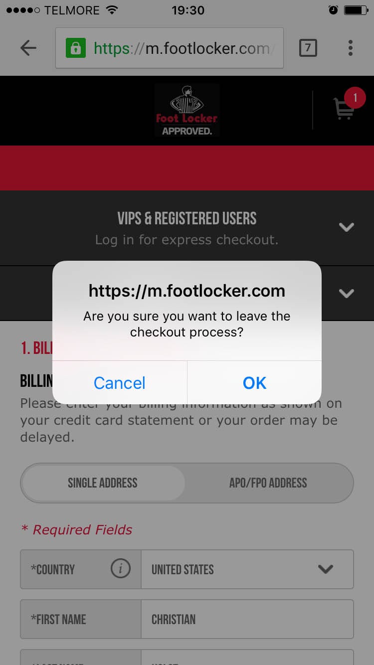
When the company logo is tapped during Foot Locker’s mobile checkout, a dialog appears asking the user to confirm that they indeed want to leave the checkout process. This is a good use of the “confirm” dialog, considering the rarity and non-obvious nature of the action. Of course having the action be irreversible (i.e., allowing users to go back to the checkout without any data loss — including any unsaved fields from the exit page) would be ideal, but if that implementation is cost prohibitive, a confirm dialog is a reasonable fallback.
Asking users to confirm their action (typically via the classic “confirm” prompt) tends to be easy to implement but it is unfortunately also very intrusive on the user experience and is invoked for everyone who performs the action. In other words, it requires extra effort from all users, including the many who did intend to perform the action. For example, imagine a task list that required the user to confirm each time they completed a to-do — obviously that would get very frustrating very fast. That said, it can be a cheap-to-implement way to handle accidental taps for rarely used actions which introduce significant friction if accidentally invoked (such as the above Foot Locker example).
Now, requiring users to demonstrate their intent of course doesn’t have to take the form of that classic overlay dialog — there are variations of this that are aesthetically more elegant.
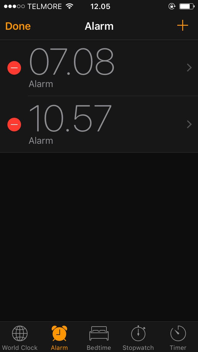
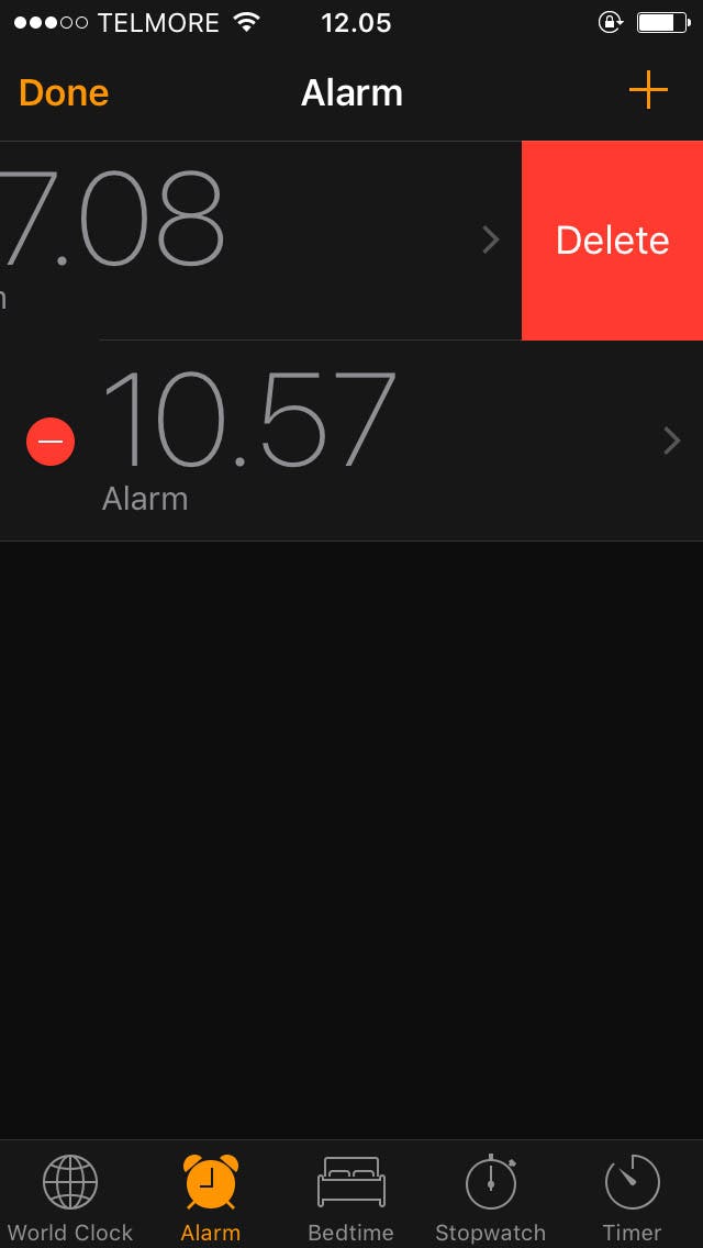
In the iOS “Clock” app, deleting an alarm can only be done by first pressing the left-hand “-“ circles, which then reveals a “Delete” button on the right-hand side of the screen, which must then be pressed to actually remove the alarm.
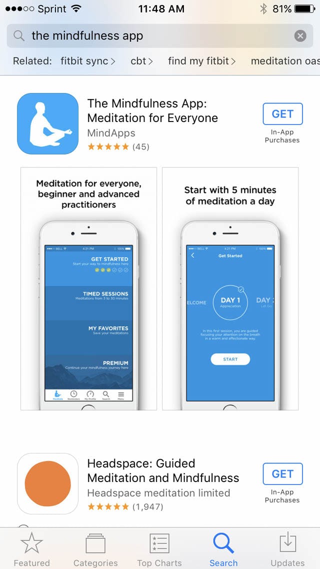
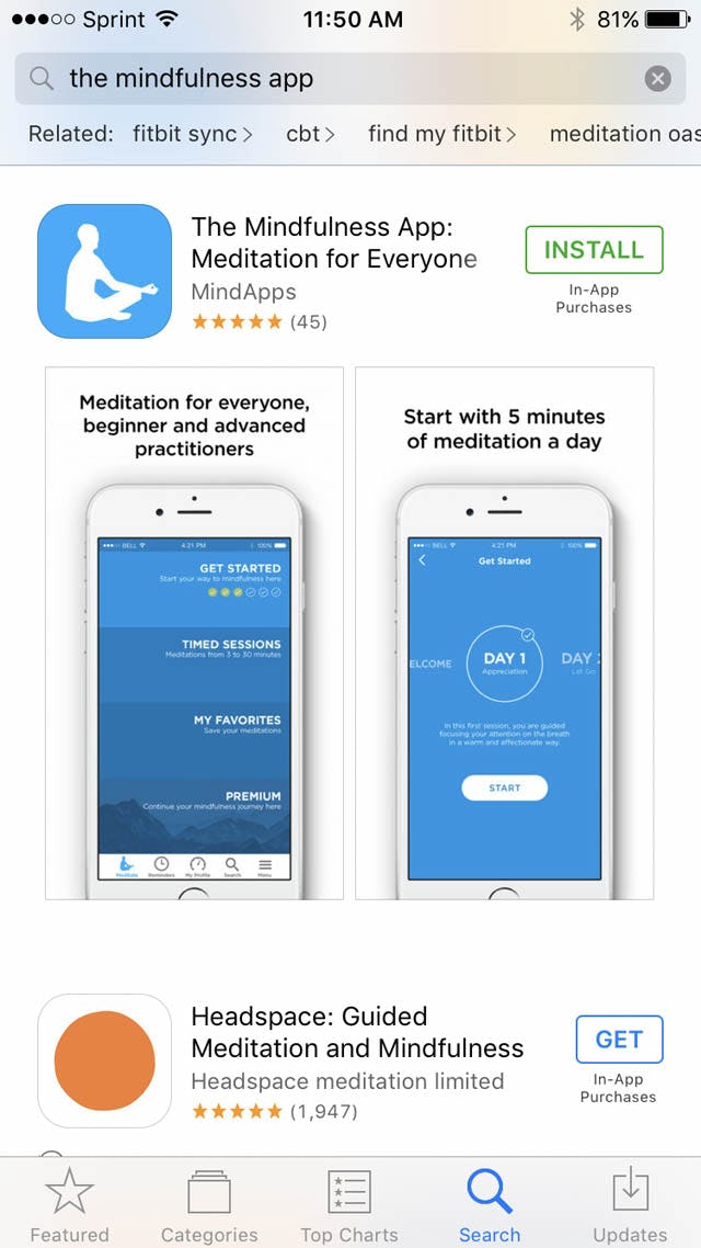
The “Get” button in the iOS App Store app transforms into an “Install” button after the initial press, effectively requiring two clicks to activate. This is similar to the “Clock” app interaction, except the confirmation button doesn’t change location, making it faster to confirm (but also prone to accidental double-clicks).
There are numerous variations of designs that basically force the user to perform the action twice — with the three most common being the ones listed above (Foot Locker, Clock, and App Store). Yet having users confirm their action doesn’t even have to mean forcing them to “tap” twice. Swipe or press and hold may be used to the same effect.

Amazon has experimented with “Swipe to place your order” in their mobile app. This avoids accidental clicks because the “button” must be swiped rather than pressed. Alas, it is a fairly uncommon UI. Image source.
Having the user perform a horizontal slide / swipe to invoke an action prevents accidental “clicks” (e.g. users bumping their finger on the display and unintentionally invoking the submit button). It’s of course important to keep the swipe direction opposite the page scroll direction to avoid the two clashing. The big downside to the swipe design is that it’s a vastly more complicated user interaction and somewhat uncommon user interface on websites. While the design pattern did get some user awareness by being the default unlocking gesture in earlier versions of iOS and Android, neither of those operating systems rely on that gesture for unlocking any longer, and thus the gesture may soon return to obscurity.
A similar design approach (which also works for mouse-pointer devices) is “press and hold” (also known as “long press”). That is, the user must press / click the action and then hold it down for a second or two before it is invoked. Alas, this strategy appears to be even less common on the web than “slide to submit.”
In general, the UX friction introduced by having to demonstrate intent isn’t very high but it is a tax that’s levied on all users, each and every time they do want to perform that action. “Demonstrating intent” is therefore an undesirable design strategy for actions that are performed frequently, although it can be justified for less-used actions — in particular when the severity of accidental taps would be high and “Reversibility” would be too expensive to implement.
Strategy #3: Reversibility (or “Time Machine”)
Allowing users to reverse their action is the final and — from an end user perspective — ideal design strategy. However, it can be technically difficult to implement, and sometimes not possible to execute without delaying the action (e.g. sending e-mails cannot be undone, so the only way to offer “undo” is to delay the sending of all e-mails).
For links and page navigation, we get “undo” for free via the browser’s “Back” button (note: make sure to honor the user’s “Back” button expectations whenever you implement AJAX-based page overlays, list item filtering and sorting, accordion checkouts, and pagination). However, for things like form submissions and “Delete” actions, “undo” is often a lot more complicated, both from a logical and a technical perspective.
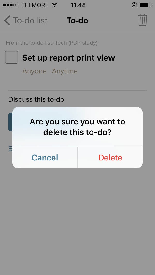
In an earlier version of the Basecamp app, users were asked to confirm their click on the “Delete” action.
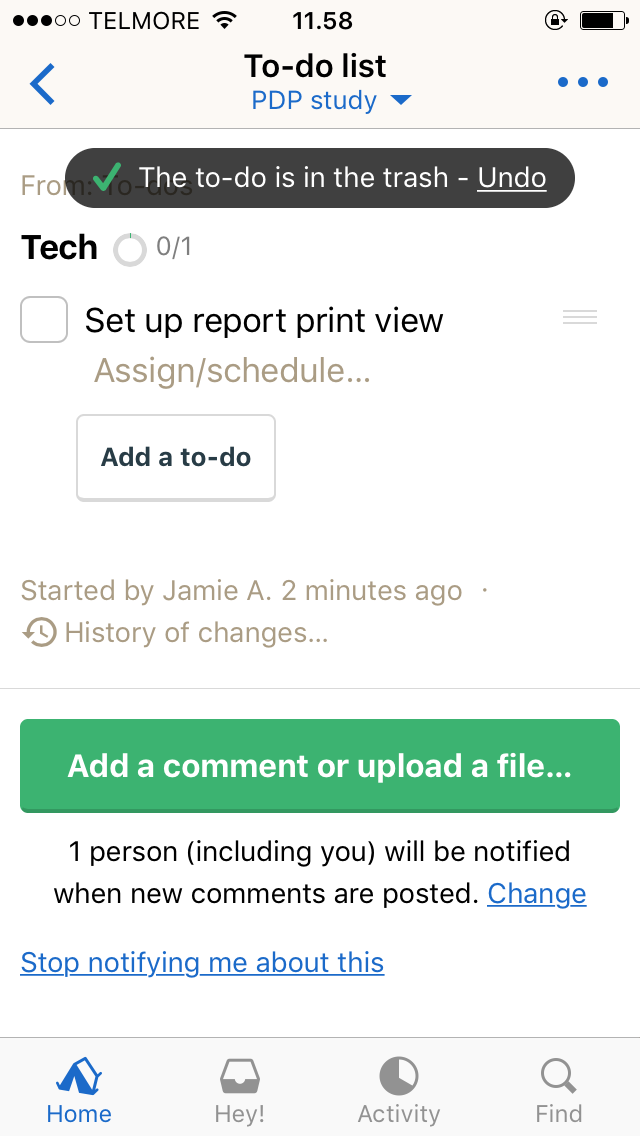
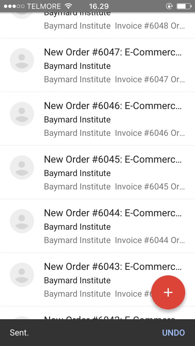
In the most recent version of the Basecamp app, the user is no longer asked to confirm but is instead offered the ability to undo their deletion.
Let’s take the action of deleting a to-do item as illustrated in the above Basecamp examples. In order to make this action reversible, the system cannot actually truly delete the to-do item, but must instead mark it as “deleted” and keep it in the database so that it can be pulled back if the user wants to undo that deletion. This opens up a range of edge-case scenarios that can be tricky to handle — for instance, what if the user decides to undo a to-do deletion but the list that it originally belonged to has been removed in the meantime (e.g. by another user)? It’s of course far from impossible to handle these scenarios, but it can be logically and technically complex.
What’s paid in implementation costs are often gained manyfold in the end user experience, however. Now, users no longer have to confirm their actions (by multiple clicks, pressing-and-holding, swiping, or otherwise) or pay the cost of the “too bad” strategy — instead they simply “click” and the action is performed, and if the “click” happened to be accidental, or the user changes their mind, they can simply revert the action with a single press. (Note: the “reverse” action must of course be offered in an unobtrusive way so it doesn’t get in the way or interrupt the flow.)
Now, there are some actions that are inherently irreversible once they are executed. The extreme scenario is the atomic bomb — there’s no “undo” once detonated. In the slightly less monumental realm of app and mobile website UIs, irreversible actions tend to involve the transmission of data from your system to an external one (such as sending an e-mail, text message, etc.). Because your system cannot manipulate the data in the 3rd party system, there’s no way to edit or undo it unless the 3rd party system explicitly offers these features. In those scenarios, the action is irreversible once executed.
Google Inbox offers undo for an action that’s actually irreversible by introducing a small time delay before the action is actually executed, during which the user can undo (i.e. cancel) the action.
When an action is inherently irreversible, one way to offer “undo” is to introduce a time delay between when the action is invoked by the user and when it is actually executed by the system — a transition period during which the action can be cancelled.
Let’s take the action of submitting a job application. In this instance, reversibility would require you to allow the user to “take back” or make edits to their application after it was submitted. This would quickly get messy — what if your HR department has already read the job application? Do they now have to re-read it? Yet, a solution here could be a 24-hour grace period, during which the end user can go in and edit or cancel their submission. Once this grace period expires, the job application is automatically forwarded to HR and can no longer be touched by the end user. In other words, if the user does nothing, the application is submitted exactly as before, yet the grace period gave them plenty time to revert their action.
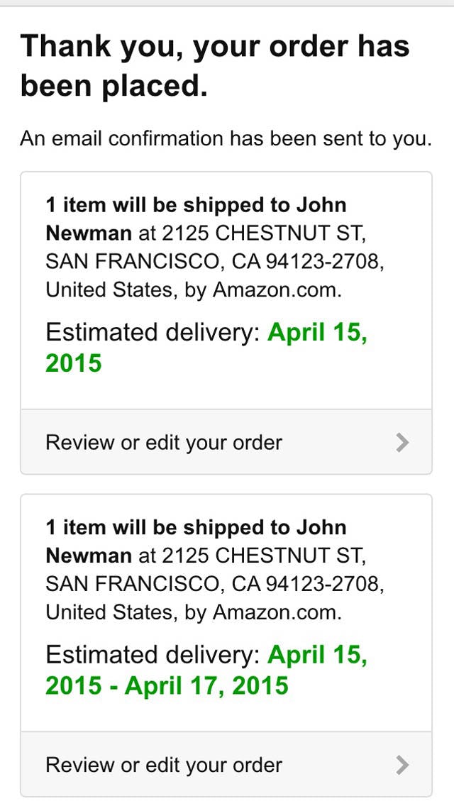
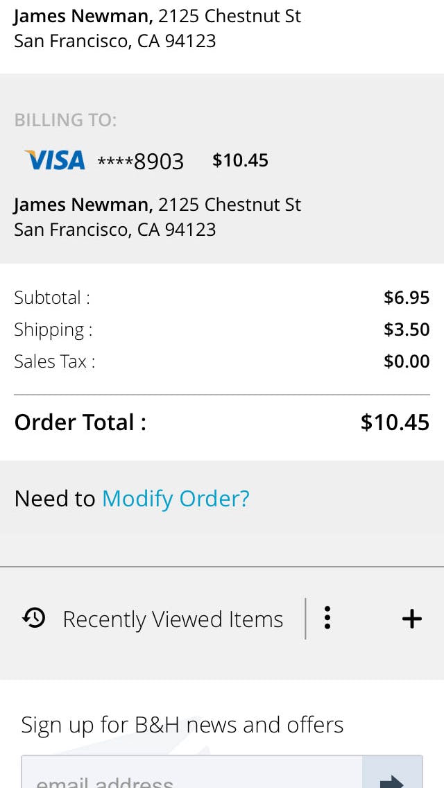
Amazon (left) and B&H Photo (right) both allow their users to edit or cancel their orders directly from the receipt page. Orders are a great example of a process that can be made reversible for a short time period (30 minutes to a couple of hours after placing the order — or right up until it begins warehouse processing).
Of course, the ultimate solution for irreversible actions such as sending an e-mail or text message would be to implement “undo” with an automatic delay but then in an unobtrusive dialog (i.e. one that doesn’t interfere with / prevents other actions) give the user the option to perform the task immediately (effectively an optional after-the-fact “confirm action” option to bypass the default time delay).
“Undo” is very powerful because it avoids adding unnecessary steps or complexity to the initial user interaction, which means that all the intentional clicks (which of course vastly outsize accidental clicks) don’t end up paying a UX cost just to avoid a few accidental submissions. It basically gives the user the best of both words: simple and fast actions with the ability to seamlessly handle any accidental clicks.
When to Do What
At its core, the question boils down to striking the optimal balance between “costs” incurred by the users and the site.
When actions cannot be remedied or taken back (e.g. sending an e-mail, sending a text message, etc.), the costs — to your business and end users — for each of the three strategies can be calculated thusly:
- Strategy #1: Frequency and “cost” of accidental submissions
- Strategy #2: “Cost” of added task friction introduced by “confirm action”
- Strategy #3: “Cost” of delaying all submissions and implementing “undo”
When actions can be remedied (e.g. deleting accidentally posted messages, calling customer service to fix it, etc.), the costs break down this way:
- Strategy #1: Frequency of accidental submissions and the “cost” of getting them fixed
- Strategy #2: “Cost” of added task friction introduced by “confirm action”
- Strategy #3: Implementation cost of “undo”
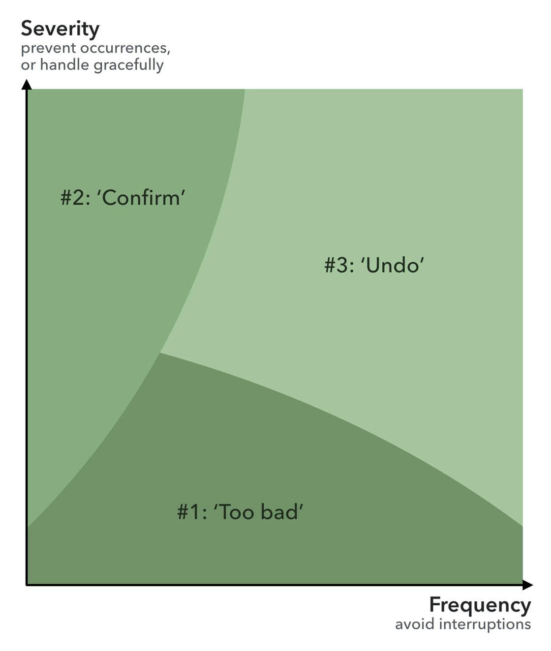
When trying to strike the optimal balance between implementation costs and end user experience, consider the two main dynamics at play here: severity and frequency.
Obviously the trick is to pick the strategy with the best return on investment. In general, the equation can be broken down into the following two dynamics:
- The higher the frequency, the more important it is not to interrupt users (i.e. use #1 “too bad” or #3 “reversibility”)
- The higher the severity, the more important it is to avoid it (i.e. use #2 “demonstrate intent” or #3 “reversibility”)
While reversibility is obviously the ideal because it ticks both boxes, the implementation costs and complexity can be prohibitive. It may be helpful to keep these two scales in mind when determining which actions to make reversible and which will have to make do with one of the other strategies. For instance, you may consider “demonstrate intent” for actions that are high in severity but low in frequency, because the UX cost of confirming is relatively low and thus negligible when used for infrequent actions.
Be aware, however, that looking solely at the total number of occurrences of an action when determining frequency can be misleading, because there is a big difference between a few users who perform the same action many times and a lot (or all) users who perform that action only once or occasionally. In other words, there’s a familiarity aspect at play too, which of course will be largely driven by the number of times a user performs the action.
Infrequent actions will tend to warrant a more “defensive” design because there’s an increased likelihood that users will inadvertently invoke an unintended action in an interface that’s unfamiliar to them. In those scenarios, “demonstrate intent” may be an acceptable tradeoff if “undo” is cost prohibitive. Meanwhile, for high-severity actions that are performed very frequently by a small group of users, you may be able to get away with the “too bad” strategy combined with extra-wide spacing between UI elements, because the users’ familiarity with the interface combined with the wide spacing will likely bring accidental clicks to a minimum.
Again, from a usability point of view, reversibility is obviously the ideal, as it seamlessly handles all accidental submissions without adding unnecessary complexity to the user experience. Yet we can be smart about when we implement what — reversibility is obviously more important for some actions than others.
Consider all costs (for the user and your company) and savings (again, to the user and your company), and use that to guide which of the three design strategies to implement for a given interface action.