Mental models are one of the most important concepts in human-computer interaction (HCI). This article reports a few examples of mental models in user-interface design. Not coincidentally, using concrete examples often helps people understand abstract concepts, such as mental models.
What Are Mental Models?
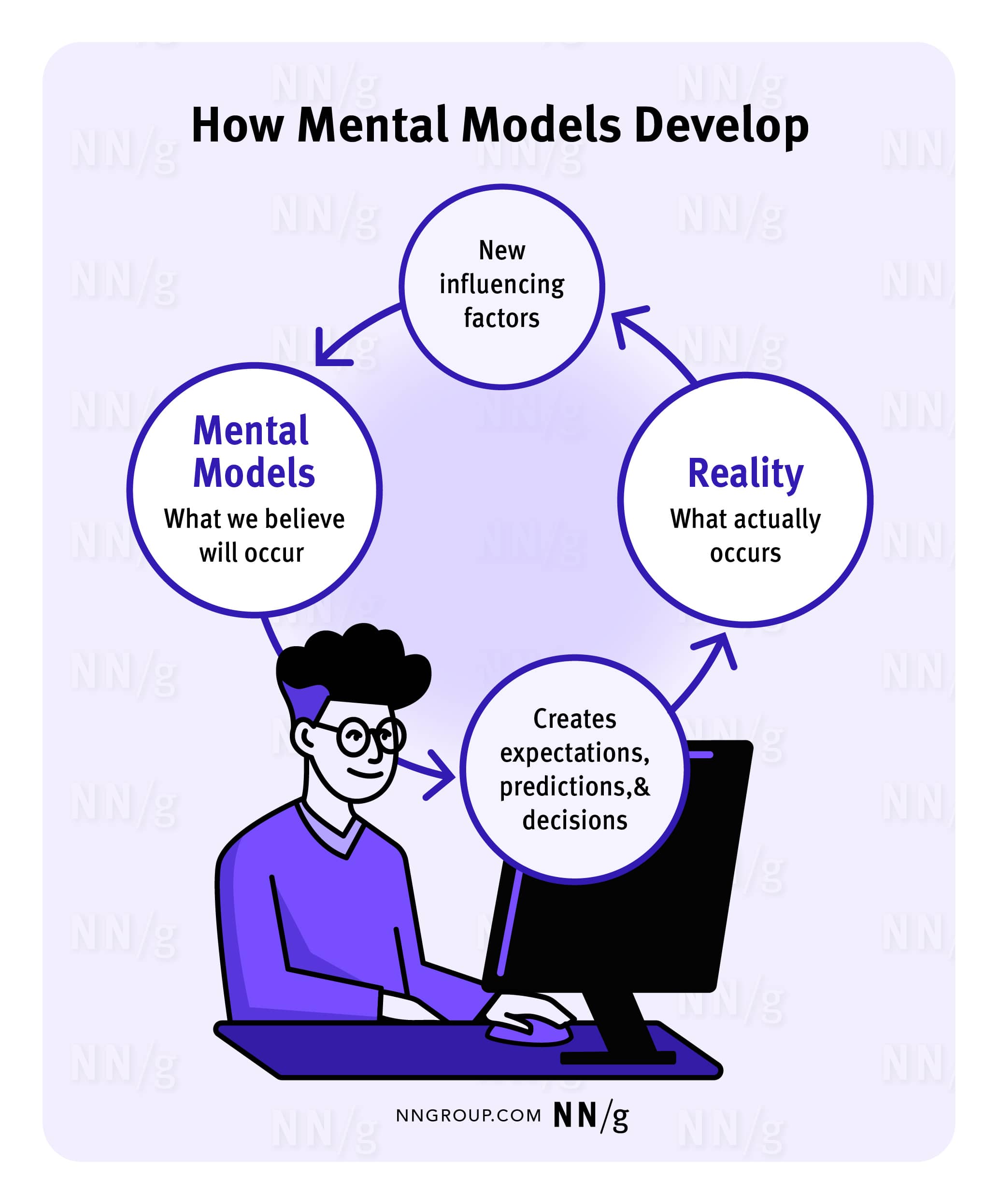
A mental model is what the user believes about the system (web, application, or other kind of product) at hand. Mental models help the user predict how a system will work and, therefore, influence how they interact with an interface.
A Mental Model Is Based on Belief, Not Facts
A mental model is a model of what users know (or think they know) about a system such as your website. Users form their predictions about the system based on their mental models and plan their future actions accordingly. A prime goal for designers is to ensure that the user interface clearly communicates the nature of the system so that users form accurate (and thus useful) mental models.
How do users create mental models? Often, they just use the knowledge they have about the world to create them. Remember Jakob's law of the internet user experience: Users spend most of their time on websites other than yours. Thus, a big part of customers' mental models of your site will be influenced by information gleaned from other sites. People expect websites to act alike.
Each User Has Their Own Mental Model
A mental model is based on each user’s individual background knowledge and past experiences, so different users might construct different mental models of the same system. One of the biggest dilemmas in usability is the gap between designers' and users' mental models. Designers form wonderfully detailed mental models of their own creations, leading them to believe that each feature is easy to understand. On the other hand, most users’ mental models of the system are usually less developed; as a result, they are more likely to make mistakes and find the design harder to use.
Mental models can change over time — due to additional experience with your system or with other systems.
Mental Models in Web UX
As users navigate the web, they construct mental models based on the patterns they encounter. This section discusses a few mental models common in web design. These mental models serve as the foundation for design standards, enabling designers to create interfaces that align with users’ expectations.
Online Shopping Carts
When shopping online, users browse through products, add items to their shopping carts, and then check out. This experience is like shopping in a brick-and-mortar store, and people’s expectations are influenced by their experience with physical shopping.
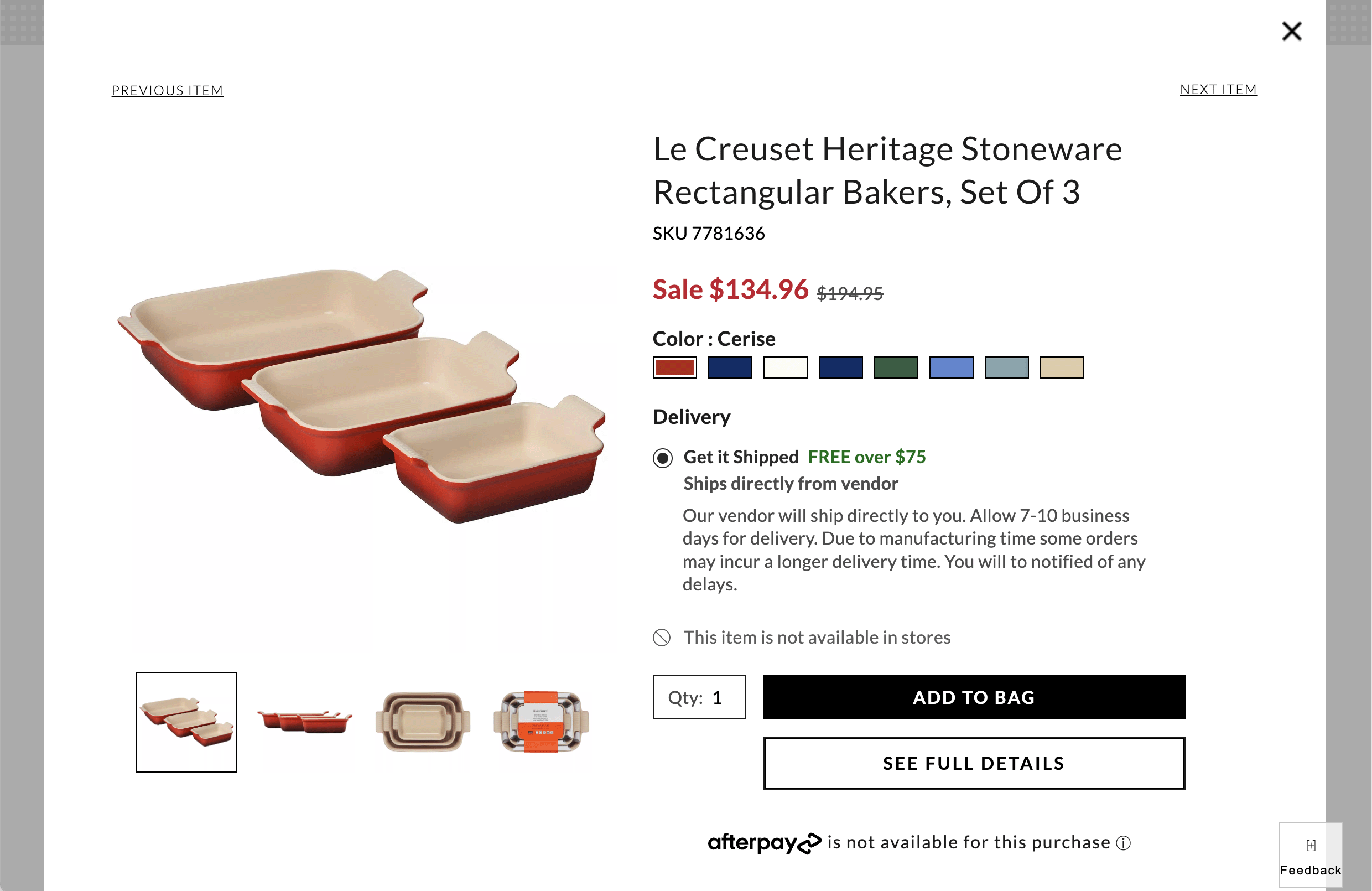
Online shopping experiences that depart from the physical shopping model create confusion. In real life, the shopper controls what goes into the shopping cart, so this expectation is carried to online shopping. When an ecommerce website violates this expectation, problems arise.
For example, Nomad Lane automatically adds shipping insurance to the total cost when users check out. Users must, first, notice this additional cost and second, actively opt out of shipping insurance. Automatic shipping insurance is not part of users’ shopping cart mental model, so this leads to frustration for anyone who accidentally pays for insurance. Adding unexpected items to a shopping cart is a deceptive pattern in UX design known as sneaking or preselection.

Back Button
The Back button is a long-standing essential in browser navigation. Over time, users have built a strong mental model for it: namely, Back is supposed to lead back to the previous screen, essentially acting as an undo.
When mobile smartphones became popular, users found themselves presented with another use of the Back button in mobile apps. Unlike on the web, where Back was used to take users to the previous screen, in some mobile apps, Back took users up in the hierarchy of the site. For example, if, while the user was reading a news story A, they tapped on a link to another news story B, the Back button would take them to the list of all news articles instead of taking them back to the news story A.
This behavior violated users’ expectations. Over the years, designers have luckily understood that, and now it is rare to find that implementation for Back in mobile apps. Some remnants, however, are still in place. For example, in Android, if you happen to be on the homepage of any app, doing the Back gesture (or tapping the Back button) will take you “up” — that is, outside of the app, regardless of whether you arrived to the homepage from another page inside the app or you just tapped on the app icon.
Using the Back button with an open overlay can also lead to confusion. When a user opens an overlay, it feels like they are opening a new page entirely, especially when the overlay takes up the whole screen. So, when the user clicks the Back button, they expect to exit the overlay. However, in many cases, the user is instead taken two steps back to the page they were on before visiting the page that triggered the overlay.
Search Bars
Users expect to be able to input keywords and phrases into a search bar to find any information on a website. A single, well-placed search bar aligns with their expectations, offering a clear point for queries.
When a website has several search features on the same page, users often get confused. They’ll enter their query in the wrong box and assume that the site doesn’t have the answer if nothing comes back. (In reality, they might have used a specialized search that doesn’t cover everything.)
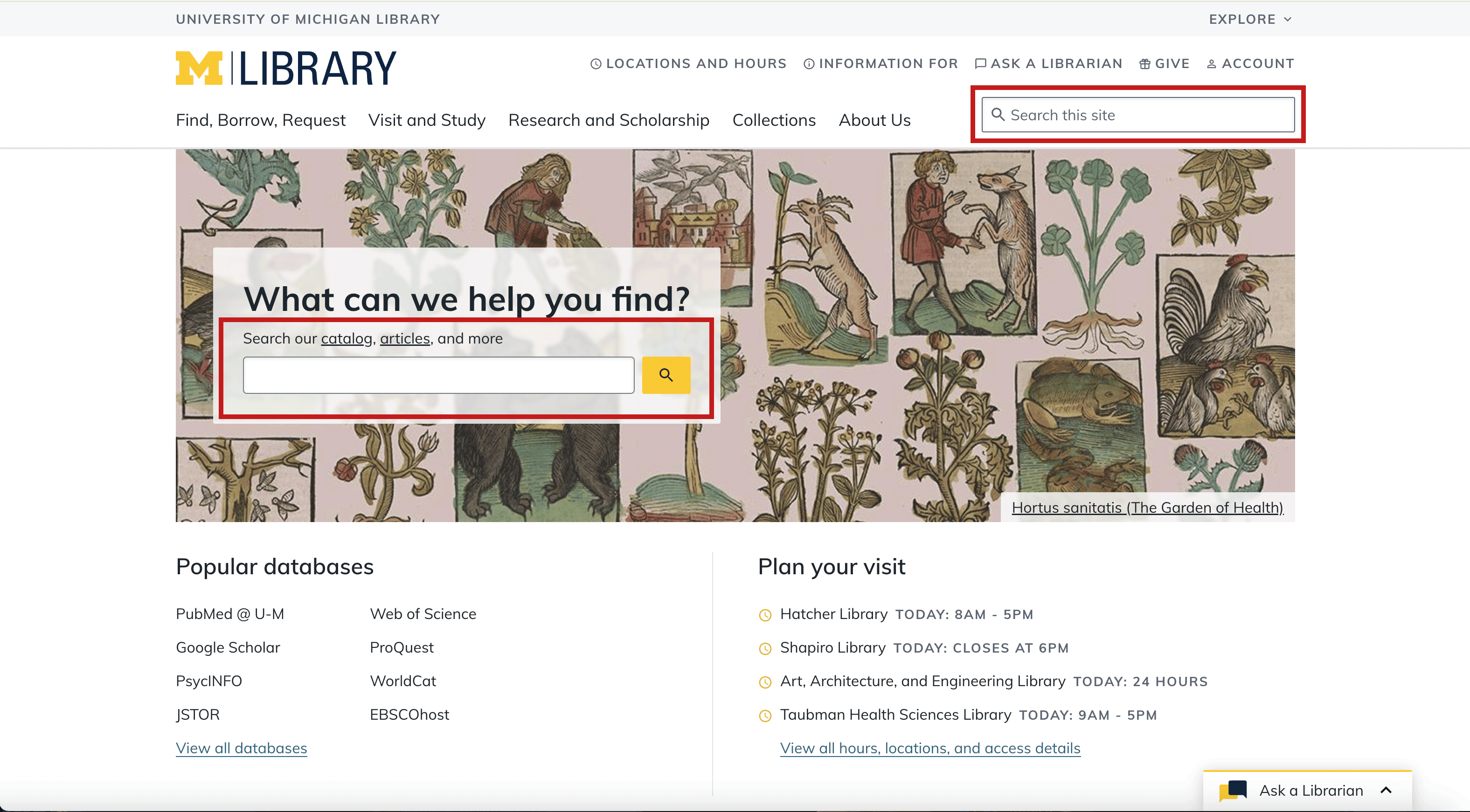
In the example below, the University of Michigan Library has two search boxes on the same page, each attached to its own database. The search box on the top right of the page is dedicated to logistical library information, while the search bar in the middle of the page is for academic research. The help text and placeholder text associated with each search bar allude to the purpose of each; however, users often perceive search bars as universal. The presence of multiple search bars introduces complexity and a potential for confusion.
Mental-Model Inertia
There's great inertia in users' mental models: stuff that people know well tends to stick, even when it's not helpful. This alone is an argument for being conservative and not coming up with new interaction styles. Sometimes, you do need to innovate, but it's best to do so only when the new approach is clearly superior to the old, well-known ways.
When you come up with a new design pattern, you face an immense challenge: How do you explain the new concept so users will construct a valid mental model of your system?
It's amazing how one misconception can thwart users throughout an entire session and cause them to systematically misinterpret everything that happens. Through failure after failure, they never question their basic assumptions. This is yet another argument for complying with preexisting user expectations whenever possible. If you don't, then make certain that you're clearly explaining what you're doing — while also realizing that you face the added challenge of users' reluctance to read instructions and help messages.
Designers are better off leveraging this mental-model inertia instead of fighting it. One example is skeuomorphism, a design trend that involves incorporating elements from the physical world into digital interfaces to guide users in acclimating to new interaction styles. Drawing on familiar, real-world mental models makes new, unfamiliar designs easier to understand.
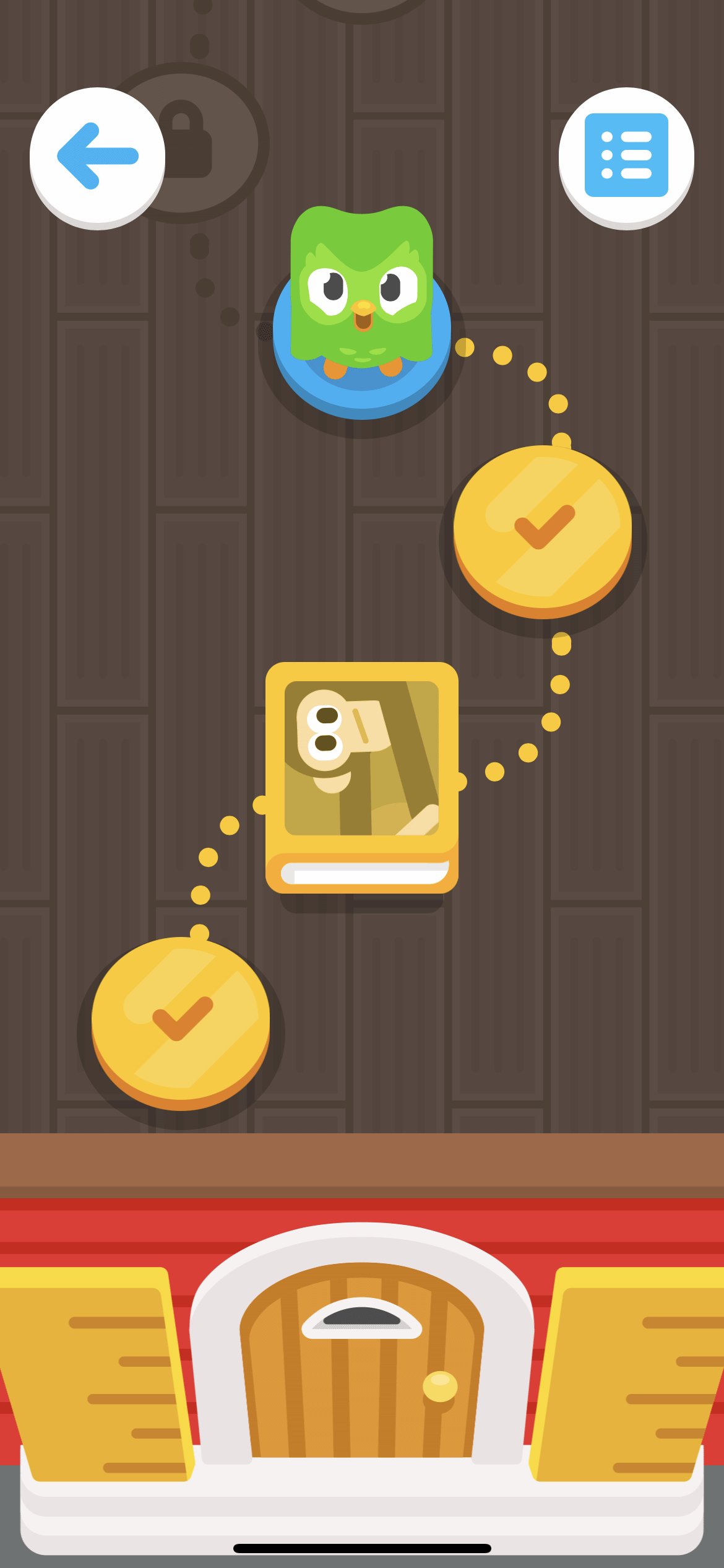
In the realm of children's apps, skeuomorphism plays a particularly beneficial role. Since young users may not yet have well-established mental models for digital navigation, apps designed for kids often use physical-space metaphors, such as maps or doors, as seen in Duo ABC, an app that teaches children reading fundamentals. This approach mimics the tangible experiences that children encounter in physical spaces, like exploring a map or opening doors to discover new areas.
Acting on Mental Models
Understanding the concept of mental models can help you make sense of usability problems in your design. If people make mistakes on your site, it is often because they've formed erroneous mental models. Even if you cannot change the UI at that point, you can still teach users a more accurate mental model earlier in the user experience. Or, you might have to acknowledge that users won't understand certain distinctions and then stop making those distinctions.
In case of a mental model mismatch, you basically have two different options:
- Make the system conform to users' mental models — assuming most users’ models are similar. This is the approach we usually recommend to fix IA problems: if people look for something in the wrong place, then move it to the place where they look for it. Card sorting is a useful way to discover users' mental model of an information space so that you can design your navigation accordingly.
- Improve users' mental models so that they more accurately reflect your system. You can, for example, explain things better and make labels clearer to guide users to form the right model (even though the underlying system remains unchanged).
Mental models are a key concept in the development of instructions, documentation, tutorials, demos, and other forms of user assistance. All such information must be short while teaching the key concepts that people need to know to make sense of the overall system.
One of the main reasons we recommend the think-aloud method of user testing is that it gives us insights into a user's mental model. When users verbalize what they think, believe, and predict while they use your design, you can piece together much of their mental models. There are more advanced knowledge-elicitation methods for gaining deeper insights into mental models, but for most design teams, a few quick think-aloud sessions will suffice. In any case, simple user testing is certainly the first step to take if you suspect that erroneous mental models are costing you business.
Conclusion
Mental models are an essential concept in UX design and significantly influence the decisions users make while navigating an interface. Understanding users' mental models helps designers create interfaces that resonate with users’ expectations.