
iOS 7, Apple’s operating system for their tablets and mobile devices, moves away from the skeuomorphic design that characterized earlier versions of iOS. The new look is drastically different from the previous operating-system iterations and it boldly parts with some of the conventions that Apple had worked hard to establish over the past 8 years. But is the new design really better? Whether you like the new look or not, some of the new features are welcome usability improvements, whereas others are likely to cause pain.
Buttons and Flat Design
Let’s start with the elephant in the room: the flat design. What makes iOS 7 look so different from its previous incarnations is the decision to move the chrome into the backstage and leave the spotlight to the content. While this decision reflects the well-publicized mobile precept that says to prioritize content over chrome, it can also cause confusion.
Buttons and interface widgets, when present, need to be easily distinguishable from content. They need to have good affordances that invite users to action. In the absence of strong signifiers, they can get ignored, and users may find themselves lost and disoriented.
Flat design is by no means Apple’s invention. In fact, if anything, it seems to be quite fashionable in the mobile world, with Android and especially Windows 8 toying with it at variable extent. Back in 2012, when Windows 8 came around, we noted that users had difficulty distinguishing content from chrome: people missed important buttons on the screen because they looked too much like plain text.
That being said, flat design is not necessarily hopeless. 3D is just one of the many cues that can invite users to tap. Other cues are shadows, coloring the links differently (as on the web), or even the placement of those links on the page.
So far, in Apple’s apps, these cues do a good enough job of signaling tappability. Many of the apps that we’ve seen so far are decent; there are clear differences between what can be pressed and what cannot. Some of the cues rely on users’ previous knowledge of iOS and the web.
For instance, when configuring an email account on the Mail page under Settings, there are several tappability cues:
- Blue color in the navigation bar (<Mail in the top left corner) – this takes advantage of the previous web knowledge (blue is a link on the web) and iOS knowledge (items in the navigation bars are tappable)
- Arrow in a table view (next to Mail Days to Sync) – this also relies on previous iOS knowledge
- Toggle switches that look like sliders that can be moved
- Red color, text centering, and position at the bottom of the page for Delete Account – these are all weaker cues, but they all reinforce each other

As this list shows, even in a single screenshot, the colors used to indicate actionable text can vary. The inconsistency makes this screen harder to use, but worse, it makes other screens harder as well, because it reduces learnability.
When Apple or Google or Microsoft introduce a new look for their mobile operating system, they are also responsible for design guidelines to help app creators replicate that look. Those guidelines should be robust — it shouldn’t be easy to misinterpret them in a way that makes the designs unusable. Unfortunately, flat design is prone to such misinterpretations.
Whether app designers will know how to create the right tap affordances in the absence of proper buttons still remains to be seen. So far it looks like some apps (for instance, The New York Times) are proceeding cautiously, choosing to use borders and other cues to make sure that users know where to tap.

Others, such as Mobile Inspect (an app for used-car dealers) fully embrace the lack of buttons and generate harder-to-use designs:
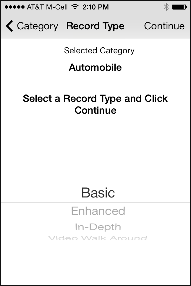
In Mobile Inspect’s design, it’s hard to say what the call to action is and what the user is supposed to do on the page. Of course, if the user reads carefully all the text on the page (which they usually don’t), paying attention to things like verb tense (Selected Category versus Select a Record Type and Click Continue), he will figure it out eventually. But we know from countless hours of testing that people don’t like to think hard, read thoroughly, solve puzzles, and make inferences while using a mobile app: the interaction cost is just too high, and most mobile sessions are short and prone to interruptions.
In Mobile Inspect we can also see the new picker introduced in iOS 7:

The older- iOS picker was already quite impractical — because it only used half the screen, it made a poor choice for long lists:

The new design makes the picker even smaller by using a focus-plus-context visualization (discussed in our course on human-computer interaction): only three items are clearly visible. The others appear distorted and in lighter font; they are harder to read, although perhaps not unreadable. The new picker doesn’t have any clear usability advantages, except for the “cool” design.(Focus-plus-context visualizations usually make sense when an item’s neighbors are usually more relevant than items that are farther away in the same list. For instance, in a calendar, you could imagine that time slots around an event are more relevant to the event than time slots far away. For most dropdowns, the items in the list are equally relevant irrespective of their position in the list.)
Swipe Ambiguity
Swipe ambiguity means that swiping in different places on the screen leads to different results. We first discovered swipe ambiguity when we tested iPad apps that made use of swipe for turning pages. Later on, in its Windows 8 tablets, Microsoft incorporated swipe ambiguity at the operating-system level when it decided to use swiping (1) to expose controls, and (2) for navigation.
iOS 7 has also embraced swipe ambiguity. Swiping near the left, bottom, or upper edges of the screen can cause problems if the swipe is not precisely executed. Let’s talk about each of these swipe gestures.
- Bottom edge: Control Center. Swiping on the bottom edge of the screen exposes the Control Center, a place where some frequently used functions of the phone are grouped together. The idea of a quickly accessible Control Center is laudable, since people won’t need to navigate through the iPhone settings to put their phone in airplane mode or turn on the Wi-Fi. However, the placement interferes with a very common gesture on touch screens: scrolling down to see more content.
Here is an example. If, in Safari, the user were reading an article like the one on the left in the image below, she may accidentally trigger the control center while trying to scroll down:
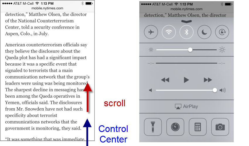 Scrolling vertically on a page can accidental trigger the Control Center.
Now, this functionality can be disabled in the iOS Settings by turning off the access to the control screen. But we know from previous testing that people rarely take the time to alter a default. (And a CHI 2007 study from Michigan State University showed that even tech-savvy users such as Slashdot readers rarely change the default interface.)
- Top edge: Spotlight Search and notifications. In the previous iOS versions the Spotlight Search (Apple’s global device search) was accessible by swiping on left edge of the first page of the device home screen. Users who had several app pages needed to navigate to the first one and then swipe on the left edge to invoke the search. In iOS 7, this interaction cost has been reduced:now users can access the Spotlight Search on any of the home-screen pages by swiping down somewhere below the status bar. This feature comes at the price of swipe ambiguity.
Indeed, users who want to search must be careful not to touch the top edge; if they did start their swipe gesture in the status bar, the Notification Center would appear instead of the Spotlight Search:
 Swiping for the Spotlight Search can accidentally trigger the Notification Center.
 -
Left edge: Safari. Another example of swipe ambiguity comes from Safari. In the newer Safari, swiping on the left edge of the screen takes the user back to the previous page. (Swiping on the left also means “up” or “back” in several other Apple apps – it looks Apple is trying to compensate for the lack of a Back button by using swipe as Back consistently.)
Because of swipe as Back, any webpage that contains a carousel can get into trouble in the new Safari: swiping the carousel back and forth (a fairly standard touch behavior) may take the users to the previous webpage instead of the previous image in the carousel.
Apple itself is not exempt from the swipe-ambiguity trap —Apple.com has a big carousel on the front page:
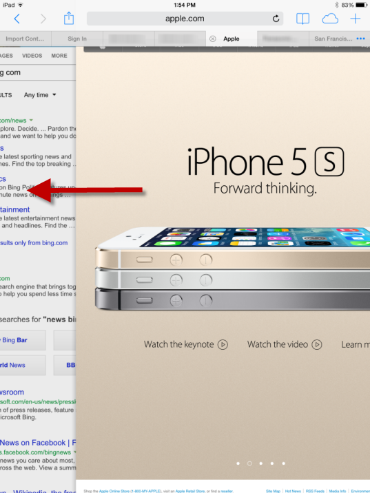 Swiping back to the first image of the carousel can accidentally lead outside the Apple site to the previous site that was visited.


With swiping as back Apple takes one more step into the realm of gesture-based interfaces. On touch screens, their allure is that they can take the place of interface widgets and free up screen space for content. Back in 2010 the first iPad interfaces tried to take advantage of gestures, but the result mostly confused users. New gestures were hard to memorize and discover, and sometimes even hard to replicate.
With the gestures embedded in its apps, Apple took the right approach most of the time: because gestures are fairly undiscoverable, they were assigned to nonessential, power-user features (for instance, shake to undo) or there were other ways to achieve the same effect. Thus, in the Mail app, users could (and still can) swipe to delete, or could take a detour and use the Edit button. Similarly, with the new iOS 7, they can swipe to go back to the previous page or they can use other visible controls (in Safari — the back arrow; in Mail, Settings, Contacts, and Notes — the back control in the navigation bar). Although we normally do not advocate redundancy in interfaces, gestural interfaces are one notable exception: because gestures have low affordance, discoverability, and memorability, some users never use them. That can be OK for more advanced features (such as the Spotlight Search or the Control Center), but it is not OK for basic interface functions such as navigating back to the previous page. In those cases, a button can save users hours of frustration.
Everything Else
We mentioned two issues that we think will give trouble to users in the iOS 7. There are other features that benefit the users, and we enumerate them here.
Hiding the controls in Safari. Web pages gain a few more pixels of content because the browser controls disappear shortly after the user navigates to a new page if she moves down the page, indicating that she wants to read it. Once the user starts scrolling up towards the top of the page, the controls reappear. This is good: Apple took the right route by not hiding controls altogether from the beginning; subtle cues such as scrolling up and down are rightly interpreted.
Unlimited number of files in a folder. Gone are the days when people were forced to have three Games folders to host the many games apps they installed. Users won’t have to remember which game folder contained a specific game. Of course, now they will have to deal with finding that game within that unique folder. (But menu research shows that breadth is generally better than depth, so overall we think it’s a change for the better.)
Multitasking. Before iOS 7, one of the few differences that we observed between Android and iOS users was that Android owners were a lot more concerned with battery life and task management. Now the door has opened for iOS users to experience the same worries. (Apple says that their smart multitasking will protect the battery.)
On the plus side, apps can now update in the background and users won’t need to wait for the data to refresh when they open their favorite app.
Global font-size control. People can change the font size for all the apps that support dynamic font-size adjustment. This is a great feature, particularly for middle-aged or older users (provided that users will get to it and that apps will allow the adjustment – again, not many of us like to fiddle with the defaults).
Settings is more streamlined and easier to navigate. Do not disturb no longer lives in two different places (under Notifications and in the main Settings). And we have high hopes for a redesign change for the Wi-Fi page that previously caused many of our users some hassle:

When people wanted to select a network, in iOS 6 (left screenshot above) they would often tap the blue arrow on the same line, accidentally getting to the advanced Wi-Fi settings. Now the arrow has been replaced with a circled i , an icon usually associated with help or extra information. Presumably this change will make users more aware of the double functionality present in the table rows under Choose a Network —tap the circled i to get to the advanced screen, tap elsewhere in the row to select the network.
Change Is Bad
In this article we focused on interaction design, not visual style. However, both are components of the user experience, together with the writing:
- Visual style is how the system looks.
- Interaction is how the system feels.
- Content strategy is how the system sounds (or speaks).
Other sites have spilled many words over the new visual style in iOS 7. Most of these changes don’t matter for usability — like the new look or not; you’re going to use the screens the same.
However, one visual change does have negative usability implications: the new icon designs. Just as people have gotten used to looking for certain features under certain icons, all the icons sport a new look. Even just changing the background color of an icon is bad, because users would have gotten used to scanning the screen for “the red square” or something like that. Changing the actual content of an icon is even worse, because it destroys users’ ability to recognize it.
Apple has demolished millions of hours of user learning by changing the icons.
While definitely bad for usability, the icon changes are not a full-blown catastrophe because the visuals are supplemented by labels which don’t seem to have changed. So users can still find, say, the photo icon, even if they can’t recognize it anymore and thus have to spend more time looking for it.
Changing something people have gotten used to is bad in itself. It can be worth doing anyway if the new design is so much better that the long-term usability benefits outweigh the short-term penalty of relearning. Are these new icons that much better than the old ones? Probably not. But users will learn the new icons within the first month or so of upgrading, after which usability will have been restored. Unless Apple makes another radical icon change in iOS 8.
Is iOS 7 Fatally Flawed?
The short answer is no. Simply because there is no such thing as fatally flawed designs: we can always learn from mistakes. What’s surprising is that we don’t learn from someone else’s mistakes: Apple ignored some of the hurdles that Microsoft experienced with flat design and swipe ambiguity in Windows 8. We still have to see whether Apple’s strong design guidelines will protect most app designers from not getting lost in the flat 2D world. Early experience with applications redesigned for iOS 7 is fairly negative: several have worse usability than their iOS 6 versions.
Reference
Lampe, C., Johnston, E. and Resnick, P. (2007): “Follow the Reader: Filtering Comments on Slashdot.” Proceedings CHI 07 conference.


